
When I started working as a professional portrait photographer, I was a bit obsessive about everything being perfect in the picture. Close-ups were my stock-in-trade, and I aimed to keep things very simple.
However, when I joined the Independent Photographers’ Group in 1997, which had members with a photojournalistic background such as Tom Stoddart and David Modell, I became increasingly aware of environmental portraiture.
I noticed good photographers are able to pull back and include what might seem like clutter in the frame, yet their pictures retain tension and interest. I realised that if there’s something your eye goes to within a frame, it doesn’t really matter if it’s cluttered. In some ways, the beauty is in the imperfection because this shows it’s real and authentic.
So, in addition to close-in portraits, I started taking more subtle pictures that you could look at, live with and reflect on, rather than pictures that were all on one note. This is what I aimed to do when photographing the artists Gilbert Prousch and George Passmore, otherwise known as Gilbert & George.
They have worked together since the late 1960s and for many years have lived in London’s East End. In 2001, I was commissioned to photograph them for a feature in The Herald, the Scottish broadsheet newspaper. I arranged to meet them at the White Cube art gallery in London, when it was still in Hoxton Square.
I initially decided to shoot them in a stairwell at the gallery’s grungy offices, and asked my assistant to set up a light. While he was doing this, and because I like improvising, I took Gilbert & George outside to walk around the area, photographing them at different locations.
In 2001, Shoreditch wasn’t the gentrified area it is today. There was a lot of rubbish on the streets and it generally had a rougher edge. At the time, I was living in nearby Hackney, so I was familiar with the geography of the place.
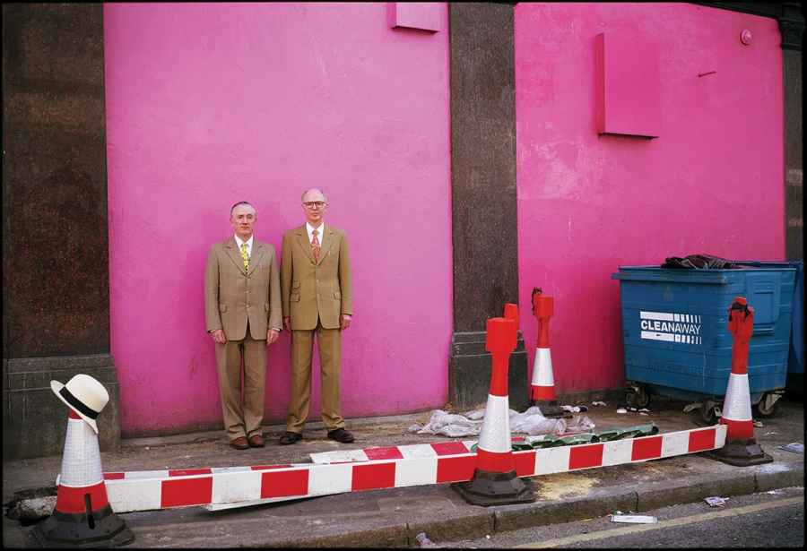
As we walked around, I saw some walls painted vivid pink behind a club called the Mother Bar at 333 Old Street. I thought it would be interesting to use the pink background as a kind of ‘found studio’. I started by taking some close-ups of the two of them, including one with them holding hands. For these shots I was using my Fujica GW690 – a 6×9 rangefinder with a fixed 90mm lens.
The suits, formal pose and Parker pens identify this pair as Gilbert & George
It was a bright day and although the wall was in shade, the light was reflecting onto a white wall behind me and bouncing onto Gilbert & George. It’s often better to photograph people in the shadows as you don’t have to deal with areas of light and shade in the image, and people are not being dazzled by direct sunlight and squinting into the lens. As a result, the pictures end up being more intimate, as you have more of a connection with the subject.
After shooting the close-ups, I decided to step back and include more of the scene around them. The foreground was quite messy; there were traffic cones and barriers, litter including a discarded parking ticket and a skip. George put his hat on one of the cones. Although it was untidy, it seemed appropriate. It was representative of the area in which they lived, and it also echoed the kind of clutter and everyday detritus they show in their artworks.
I also liked the idea that this is a strange, slightly surreal scene that you might come across while walking around London. You’d turn a corner and there would be Gilbert & George standing stiffly in their suits and staring at you.
They were happy to play ball with my ideas, either because I seemed sincere, or because they regarded the whole process of shooting a portrait for a magazine feature as being a playful piece of nonsense. Either way, they did exactly what I asked. Like most people, they preferred to be directed towards something specific the photographer wants, rather than having the aesthetic decisions deferred to them.
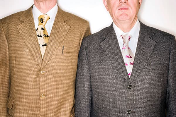
The second time I photographed them was for GQ Style magazine, a few years later. The picture I most like from that shoot shows them with their heads cropped out of the picture, lit with a ringflash [above]. It might seem unusual for a portrait to exclude people’s faces, but to me it seemed the obvious thing to do.
They are instantly recognisable but not for their faces; they’re known because they always stand in the same formal way, they wear the same suits and smart ties, and they have Parker pens in their top pockets. It’s partly about them being ‘living sculptures’, but I think it’s more about branding.
They’re aware that they are projecting a brand and they’re in on the joke, but the façade never really crumbles and they don’t acknowledge it. So I thought I’d take that idea to its logical conclusion and just photograph the brand, because all the time I’d photographed them, I didn’t feel I’d found out anything about them.