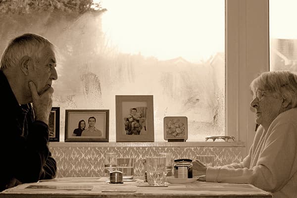
Photo: Old Age
Taken by: Simon James
Canon EOS 1100D, 70-300mm, 1/200sec at f/8, ISO 800
I rather like this scene that shows Simon’s nan conversing with his father over the table. There is a great sense of family in the image, even though only two people feature, as the portraits on the windowsill fill in for at least some of the people who are missing.
The steamed-up window adds to the atmosphere of being warm indoors on a cold day, but also prevents us looking out into the distance and away from the characters.
Although Simon acknowledges that lighting is key, the image is a little flat, and the light coming from behind the camera position has created a hard and distracting shadow of his nan’s profile on the window frame.
It looks a bit like flash, but I can’t be sure, plus it’s coming from an angle that does nothing to accentuate the features of our subjects. I’d rather just have had the light from the window – perhaps with a reflector.
The main issue though, for me, is that Simon has cropped in a little too tightly. There is a giant space between the two people that draws us in, but the space only looks giant in proportion to the space in the rest of the shot. Had Simon used a wider lens, we could enjoy more of his nan’s house and the space across the table wouldn’t have looked as large. The subjects are cut in half too – an odd thing to do to the most important parts of a picture.
Stepping back, or zooming out, would have made for a more comfortable composition. I’ve suggested a very slightly wider view (left), but the view could have been even wider than that – depending on what’s in the scene, of course.
I suspect that the problem stems from Simon’s 70-300mm lens that he was using at the 70mm end. Either he didn’t have a wider lens, couldn’t step back or be bothered to change lens. It’s happened to us all!
I’ve also knocked out the sepia toning, first because it doesn’t look like sepia, and second because it is the first thing we see. We should see the people first, not the effects.
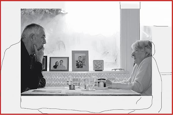
After: What the image might have looked like had Simon zoomed out for a more comfotable composition.