Light comes in different colours, which is why cameras have a multitude of white balance settings. Tungsten light is an orange/yellow colour, while midday sunshine has a blue colour. The colour temperature of light is measured on the Kelvin scale (K). For example, a tungsten light bulb has a temperature of around 3,000K.
Although our eyes see the different colour casts that are caused by different light sources, our brains account for this and as a result we only really notice when the ambient colour temperature is so strong or out of place that it throws off how our brain perceives the colours. For example, we may barely notice the shift in colour temperature when moving from a kitchen lit by cool fluorescent lights to the warmth of a room lit by low-wattage tungsten bulbs or candlelight. However, it is often only in photographs that the ambient colour temperature becomes really noticeable.
It is the job of a camera’s white-balance settings to compensate for this temperature difference, by either removing the colour cast to produce a completely neutral image or by leaving enough of the colour cast so that the picture retains a level of realism. However, selecting the correct white balance can be difficult, as a camera doesn’t know if a photographer wants the whites in the image to be white, or whether it should leave a hint of ambient colour present for atmosphere. And to further complicate things, the WB settings on different cameras don’t work in the same way.
We are taught that images should be neutral and that we should use a custom white-balance reading, measured from a white or grey card, to ensure a completely neutral colour balance, but this isn’t always a good idea. Imagine, for example, taking a custom white balance during a sunset.
Most of the orange glow we associate with a sunset would be completely lost. Instead, set a white balance that actually reflects the colour of the light, or that accentuates it slightly for effect.
Choosing the correct colour temperature
When shooting film, there are only a few options available to ensure that images have the correct colour balance. The majority of film is ‘daylight balanced’, which means it is balanced to work at a colour temperature of 5,500K to render colours correctly in sunlight. This causes images taken under tungsten light to look orange, but this can be solved by using either an 80A, B or C blue correction filter over the lens to neutralise the orange colour, or by placing a colour-correction gel over the light source. The colour can also be corrected when printing, or by using tungsten-balanced film, which produces neutral colours when shooting under tungsten lighting, but which, as a result, leaves images taken in daylight with a blue cast.
With digital cameras it is far easier to choose the correct white balance. Nearly all DSLR cameras have a selection of preset white balance settings, as well as an automatic option. However, the automatic white balance setting (AWB) does not cover the entire white balance scale of the camera, but instead selects a colour temperature from the most commonly used range. For example, on the Nikon D300S, the AWB range is 3,500-8,000K. While this range should cover most types of tungsten and fluorescent light, daylight and flash, it doesn’t cover the white balance at the extremes of the Kelvin scale. The camera itself allows you to manually select a white balance of between 2,500K and 10,000K.
The problem is that the colour temperature of light is never exact. The colour of daylight changes throughout the day, and the orange glow of a tungsten light bulb depends on its wattage and will change over its lifetime. This means that the default setting for a particular light will never be 100 per cent accurate. The default setting may also change from manufacturer to manufacturer. For example, Nikon DSLRs use 3,000K for the default tungsten setting, while Canon models use 3,200K.
 As our intention should be to try to replicate white balance as our eyes see it, the problem we face is that most in-camera white balance systems will try to completely neutralise any slight shift in colour. With this in mind, it is best to set the in-camera white balance manually.
The easiest way to do this is to select the standard setting for a particular type of light and then adjust it accordingly.
For example, set the camera to tungsten and then fine-tune the setting by increasing or decreasing the Kelvin value slightly. This is usually done by altering the default white balance setting by ±1 or 2, depending on the particular camera and the scale of adjustments it uses.
A better method is to manually set the white balance using a Kelvin value. Nearly all DSLR cameras have this ability.
Use the figures in the Kelvin chart as a starting point.
The idea is not to make the image completely neutral, as you would when taking a custom white balance reading using a grey card. Instead, you are looking to find the point on the Kelvin scale where the ambient light still adds a hint of colour and atmosphere to the image.
So, if you find when you take an image of a scene lit with a 100W bulb that the result is too neutral, adjust the white balance Kelvin setting to 3,300K. This should add a hint of orange back into the image.

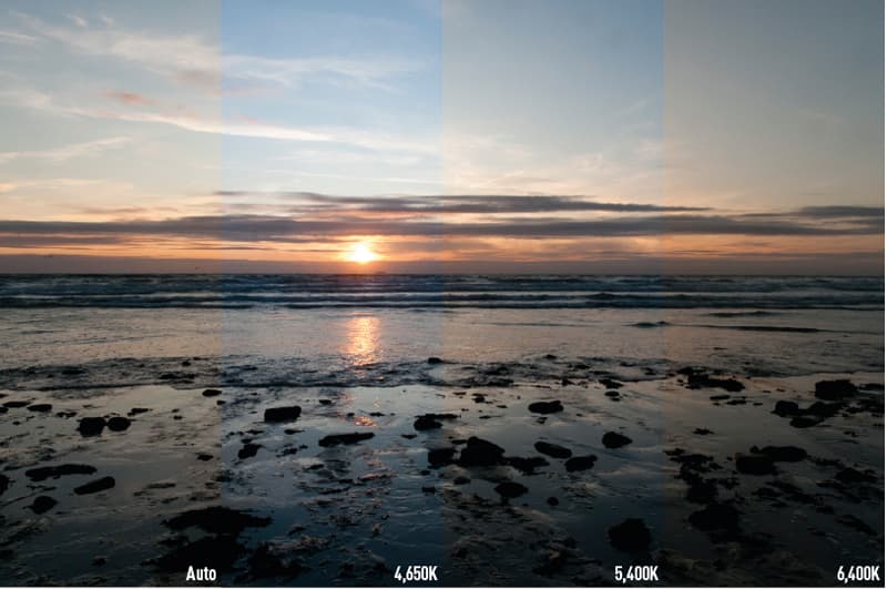
Image: This image was shot with four different white balance settings. AWB did almost nothing to correct the tungsten colour cast. Naturally, the tungsten setting removed some of the orange colour. Taking a custom white balance using a grey card produced a clinically neutral result. However, the best result is the image taken with the manual setting. This involved dialling in a Kelvin value, which left some of the warmth from the light in the image without being overpowering
Selecting the correct white balance in Adobe Camera Raw
As raw images contain all the data captured by the sensor, it is possible to change the white balance when converting the raw file. By default, when you open a raw image in Adobe Camera Raw, the white balance that has been set in the camera is the one applied to the image. However, it can be changed using the White Balance sliders.

Image: Shooting in raw allows you to make very precise adjustments to the WB of the image
There are two sliders in Camera Raw. The first of these adjusts the colour temperature, while the second adjusts the purple/green colour tint. Above this are the various generic white-balance settings, including As Shot and Auto. There are two correct white balance settings: one that produces completely neutral whites; and one that is more representative of how the scene actually looked when the image was taken. For most of the time we are aiming for the second of these two options.

Image: The WB settings in Adobe Camera Raw and other image-editing software have a number of presets that can be used as a starting point from which to make your adjustments
A good starting point is to select the Auto setting from the drop-down menu. This will attempt to rid the image of any colour casts and should give you a fairly neutral starting point from which to begin making adjustments. Alternatively, use the white balance colour picker tool, located on the top left toolbar. Click the colour picker on part of the image that should be neutral white, and Camera Raw will adjust the colours accordingly to make it neutral.
Generally, if the image is taken under daylight or tungsten lighting, make sure that the purple/green slider is set to 0. You should only be using the yellow/blue slider to adjust the colour of this light. Moving the yellow/blue slider to the left will cool the image down by adding blue. Conversely, moving the slider to the right will add warmth. Adjust until the image closely matches the colour of the original scene as your eyes remember it.
Altering the green/purple tint slider is a little more difficult as the colours tend to look more unrealistic and stand out as a result. As these colours are usually the product of fluorescent lights or an inaccurate white balance reading, it is common to see a slightly green tint to the light in shops and offices. Just like with tungsten light, you do not want it to be a dominant colour, but for realism you should leave a hint of it the final image.

Image: Certain types of lighting, notably fluorescent tubes, have a slight green or purple tint. This is commonly seen when photographing offices or commercial buildings. Leaving this tint (far right) makes the image look too green. However, removing the colour completely (far left) produces a neutral image that loses some of the atmosphere. The middle image is preferable as it keeps some of the colour created by the light, without it dominating the picture
Top Tips for white balance
- Always try to keep a hint of the colour of the ambient light in the scene to add atmosphere
- There are times when you can actually add a little more of this colour to create a mood. This is particularly true when warming up an image lit by candles or a sunset
- A completely neutral white balance is always going to look better in some situations, such as when photographing a white room or when taking studio portraits
- Use cool (or warming) cards to add a hint of warmth to an image. This works well with outdoor portraits