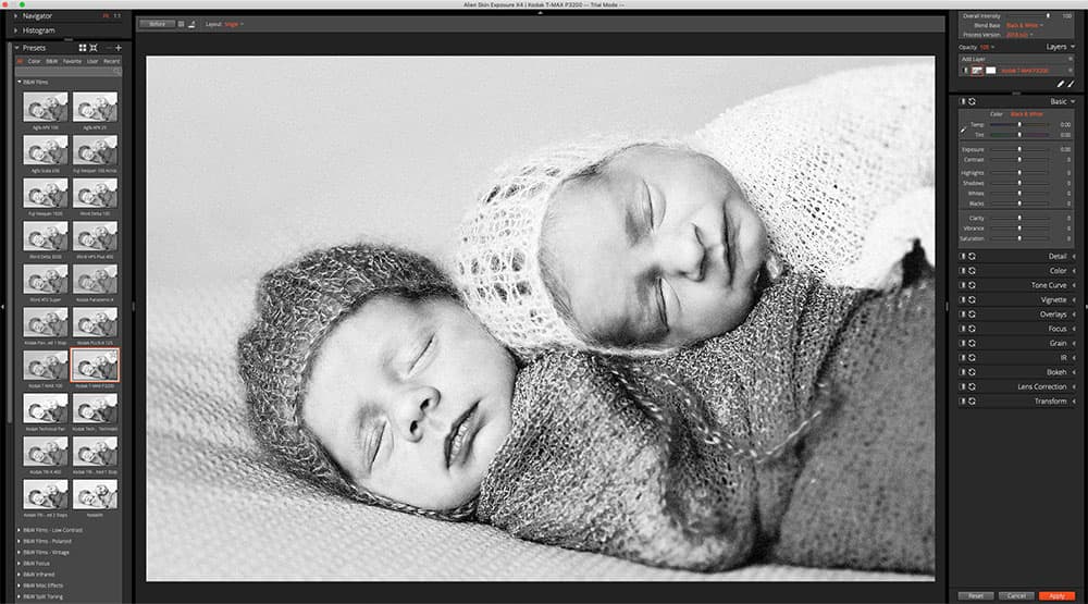
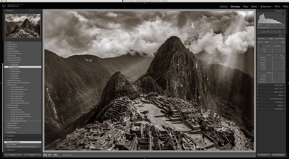
Alien Skin Exposure offers a variety of film presets – this one is Ilford Delta 3200. Nikon D800, 80-400mm, 1/500sec at f/14, ISO 640. Credit: James Paterson
Why is the appeal of black & white photography so enduring? Perhaps it’s because a monochrome treatment lends our photos a nostalgic, timeless feel that’s difficult to achieve in this pristine, high-resolution digital age. It creates an aesthetic link to an earlier time and a rich heritage of film photography. Or maybe it’s because the absence of colour can draw attention to other things, like the stark shape of a building or the texture of a person’s skin. Whatever the reason, it’s clear that, as a medium, black & white photography is as strong today as it’s ever been. But things do change. These days there are lots of tools and techniques for achieving that classic black & white film look, from Lightroom tools to in-camera tricks and plug-ins that replicate particular film stocks, right down to the specific grain structure. We’ll explore some of the best options.
When it comes to image editing, the term ‘effect’ is sometimes seen as a dirty word. But an effect is exactly what a black & white conversion is. Granted, it’s probably the most universally accepted of all image effects, but in the digital age it’s an aesthetic choice rather than the practical necessity it was in the early days of photography. As such, if we want to replicate the characteristics of black & white film then it’s helpful to think of it as a combination of three image-editing tricks. First there’s the removal of colour; then there’s the control of contrast and tonality; and finally there’s the addition of monochrome tropes like film grain, vignettes or split toning.
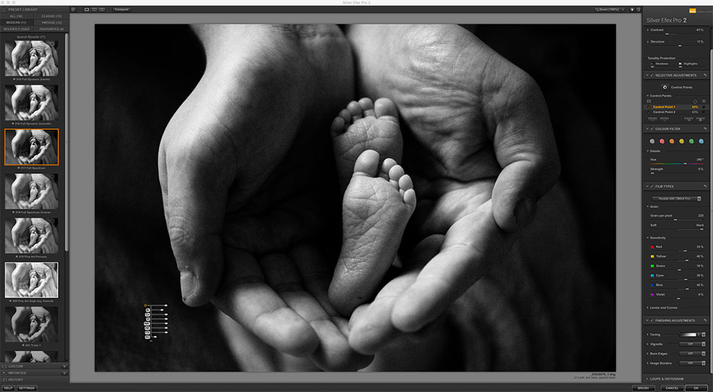
Silver Efex offers a whole host of presets, film stocks and contrast controls. Nikon D800, 105mm, 1/200sec at f/3, ISO 2800. Credit: James Paterson
Why go mono?
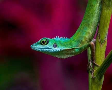
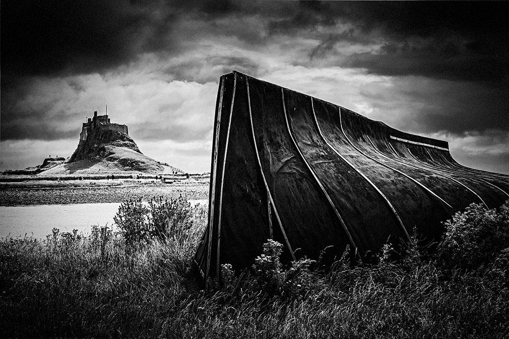
Of course, there are lots of apps and plug-ins that can apply these effects for you (a few of which are listed here), but you can also do it manually in Photoshop, Lightroom or any competent image-editing app. However, before we delve into how to make an image black & white, perhaps we should first consider why. Some images just seem to work better in monochrome. But which ones? There are no firm rules, but there are a few factors to look out for. Removing colour draws attention to form, shapes, textures and patterns. Images with bold contrast tend to work in monochrome, as do stark landscapes, and photos with a strong shape or an interesting balance between light and shade.
‘Seeing’ the world in black & white takes practice, but it can help to set your camera to a monochrome picture style to give you a better idea of how the finished image will look. Be sure to shoot in raw quality, otherwise the colour information will be stripped out of the file – and that colour information is very useful for controlling the look of the black & white image.
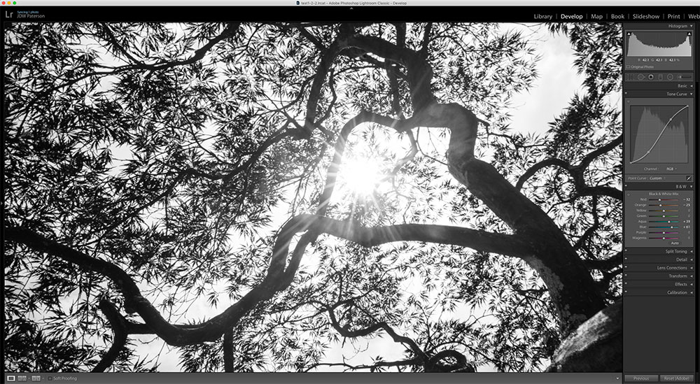
The HSL/Black and White panel in Photoshop and Lightroom is an excellent tool for mono conversions. Credit: James Paterson
The conversion
As anyone who has ever experimented with lens-mounted colour filters will know, colour is very important in black & white photography. We can use the colour information in our original digital image to control brightness as we convert to black & white. Lightroom and Photoshop both offer an excellent tool for this: the HSL/Black and White Panel. It gives us eight sliders that control the luminance of different colour ranges (we can also drag within the image to adjust the sliders). These let us control the tonality of our black & white photo by, for example, darkening the blues to make a sky more dramatic, or lifting the oranges to give skin tones a bright, airy feel.
You can create a semi-negative effect easily in Photoshop with Curves. Nikon D7000, 50mm, 4sec at f/9, ISO 100. Credit: James Paterson
Contrast and tonality
Traditionally, different film stocks would display characteristic levels of contrast, and that contrast would increase if the film was pushed during processing. When our digital images are first converted to mono they can often look disappointingly flat, so a quick boost in contrast is usually necessary. There are a number of tools for boosting contrast, but the most intuitive has to be Curves. Available in Photoshop, Lightroom and numerous other editors, Curves lets you alter brightness by affecting different parts of the tonal range. By plotting two or three points on the curve line to form an S-shape we can boost contrast by lightening the highlights and darkening the shadows. What’s more, we can control the brightness of the black & white points by dragging the top and bottom points of the curve line up or down, inwards or outwards. It’s an essential skill to learn – not just for black & white photography, but all image-editing.
Apply a Selenium look using Photoshop’s Gradient Map tool. Credit: James Paterson
Gorgeous grain
These days we refer to noise in our images, but in the days of film we would instead have to consider the film grain. Just as a high-ISO digital image displays greater noise, a high-ISO film stock (and with film, anything above 400 was considered as such) would display noticeable film grain. Both result in a loss of detail, but while the former is considered to be unsightly, film grain is often thought to add character.
If you want to get the look of black & white film then the biggest challenge is achieving a realistic grain. It’s complicated by the fact that different film stocks display varying grain, and it would be more prominent if the film was pushed in processing to gain an extra stop or two. The apps and plug-ins mentioned here let you add grain to your black & white photos. In Lightroom, head to the Develop Module’s FX panel and adjust the grain sliders. Keep in mind that the appearance of the grain will be dependent on the resolution of the image, so if you intend to print it then resize to the proper print resolution first before adding a grain effect.
In-camera grain
Grain lovers might also try emphasising grain in-camera by intentionally using a high ISO, even if the conditions don’t demand it. To take it even further, you can try intentionally underexposing the image so that it appears very dark, then recover it in post. This leads to increased noise to give your photos a lovely textured look if you find the right sweet spot between underexposure and recovery.
5 of the best tools for emulating black & white film
Credit: James Paterson
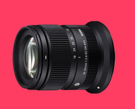
1. Silver Efex
The gold standard of black & white apps, this comes as part of the Nik Collection (recently acquired by DxO). There’s an array of useful presets, film stocks and contrast controls, plus the excellent Control Point system for making selective adjustments. The grain and vintage effects are excellent too.
Credit: James Paterson
2. Alien Skin Exposure
This is a full-blown raw editor that features a huge variety of excellent film presets. After selecting a preset from the library of 500+ famous old films, you can go on to customise it to suit your image. It’s available both as a standalone app and as a plug-in for Photoshop and Lightroom.
Credit: James Paterson
3. Free Lightroom presets
You can find tons of free Lightroom presets available online, many of which let you emulate different black & white films. A good place to start looking is presetsheaven.com, presetlove.com and presetpond.com. There are also several excellent sets available at on1.com.
Credit: James Paterson
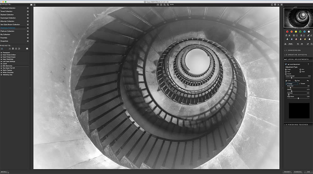
4. Topaz B&W Effects
As the name suggests, this plug-in offers a useful array of black & white toning effects, many of which replicate traditional chemical processes and techniques such as cyanotype and pinhole. Like the other apps mentioned here, you can download a free trial and experiment before you buy.
Credit: James Paterson
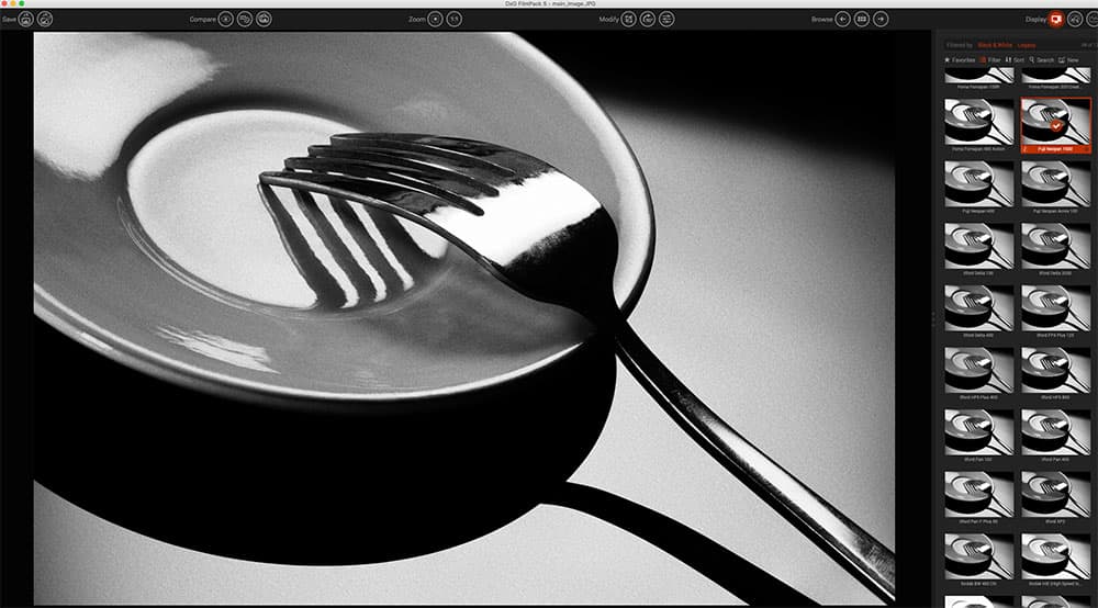
5. DxO Filmpack
For a genuine film look, this set of presets emulates the tonality and contrast of most famous film stocks, as well as grain structure. The boffins at DxO laboriously analysed film stocks to come up with these presets. There are also options to fine-tune the conversion, including excellent contrast controls.
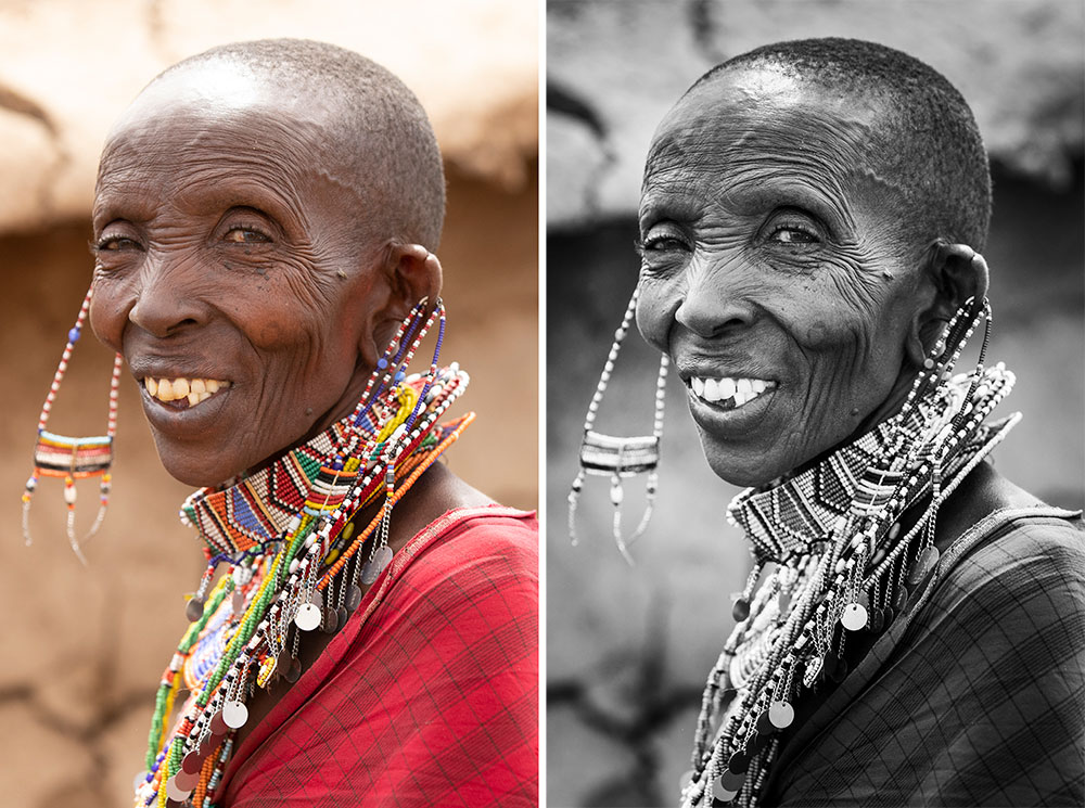
While colour is wonderfully descriptive in portraits, black & white can reveal more. Credit: James Paterson
Which one do you prefer?
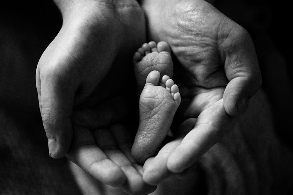
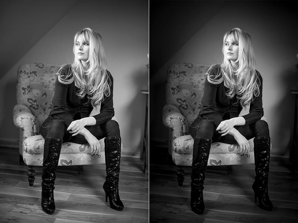
Portraits are a classic choice for monochrome treatment. Colour can sometimes be an unnecessary distraction in a portrait, especially in close-ups. By stripping it out, we can draw attention to an expression or emphasise the texture of a person’s skin. Here, for example, while the colour version is certainly vibrant and eye-catching, the black & white treatment arguably reveals more about the subject. Besides, with portraits we already know what skin colour looks like, so the presence of colour isn’t always necessary. You could argue that the necklace and beads here are stronger in colour, but the lack of colour highlights the patterns and textures instead. There’s no right or wrong; it’s about understanding how the choices we make in post-processing affect not just the look of an image, but also the message it conveys.
Before (left) and after (right). Credit: James Paterson
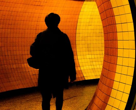
The power of vignettes
Heavy vignetting often occurred in old film cameras because early lenses struggled to draw in as much light around the edges of the frame as they could in the centre, resulting in darker corners. So by adding a vignette, we can give our black & white treatment a vintage feel. Aside from this, a vignette can be a powerful way to draw attention to our subject and away from the edges of the frame. The viewer’s eye is naturally drawn to the lighter areas of an image, so by darkening the edges we can guide the eye towards the more important areas nearer the centre of the frame. To add a vignette in Lightroom, use the Radial Filter tool and drag a circular adjustment over the image (or double-click to snap it to the edges of the frame). Don’t bother with the Post-Crop Vignette tool – the Radial Filter offers greater control.
5 tips to get the vintage look in Photoshop
Credit: James Paterson
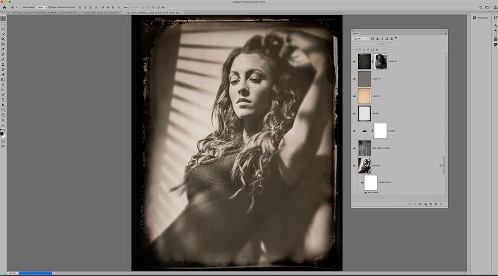
1. Messy borders
A messy border gives your monochrome image a vintage look. We used a wet plate border here, created by using a scan of an old photograph found on Wikimedia commons. Search for wet plate, then erase the middle of the frame and drop on top of your image.
Credit: James Paterson
2. Washed-out shadows
For a retro-toning effect add a Curves layer, and drag the bottom left point on the curve line upwards to wash out the shadows, and the top right point downwards to dull the highlights. You can also use Curves to add colour toning. Target the Blue channel and flatten the line as shown for a blue-yellow effect.
Credit: James Paterson
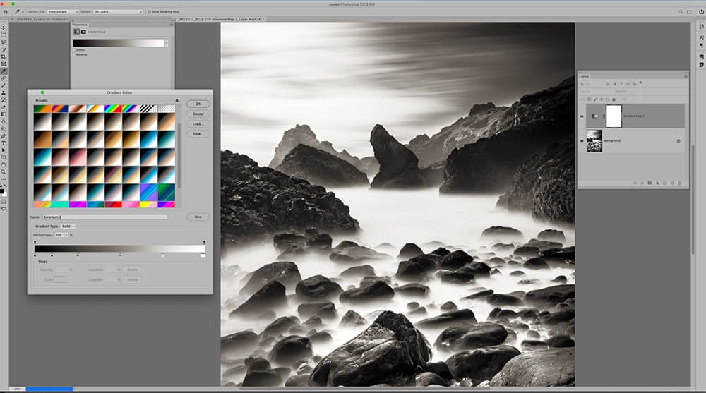
3. Hidden toning tools
There’s an excellent array of toning presets hidden within Photoshop’s Gradient Map tool. Add a Gradient Map layer (Layer > New Adjustment Layer). Click the gradient preview to open the gradient editor, click the cog icon and choose ‘Photographic Toning’. Append the presets, then click through to experiment.
Credit: James Paterson
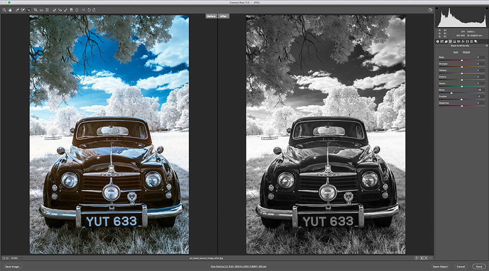
4. Infrared BW
The infrared look typically results in very bright foliage and dark skies. There are presets in Photoshop that give you this (try the dropdown in the Black and White Adjustment Layer settings), but if you want to get true infrared you’ll need to use a converted camera like the one used for this shot.
Credit: James Paterson
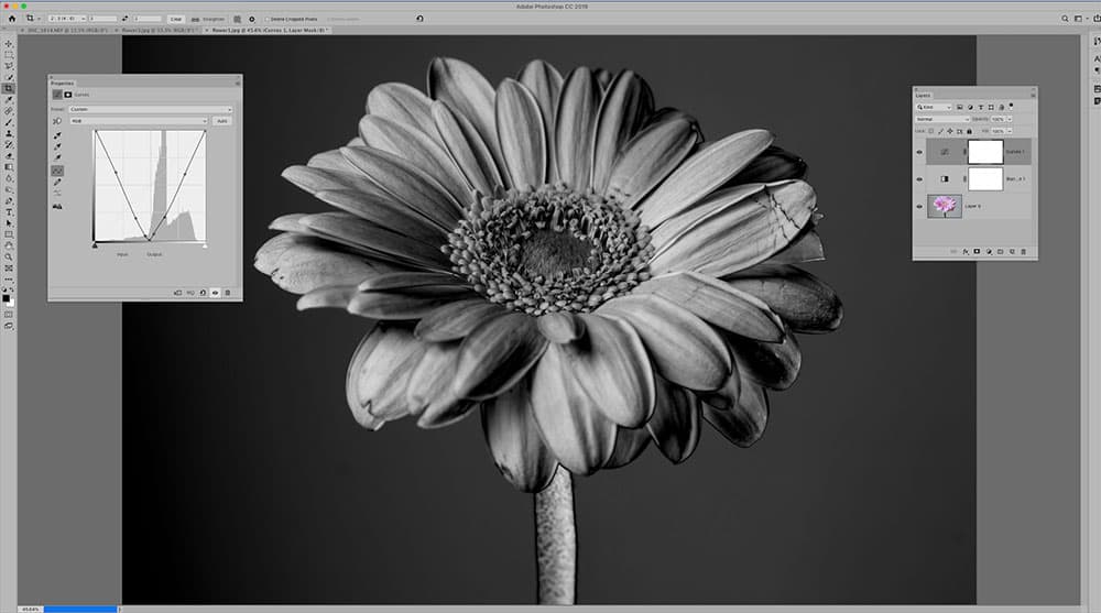
5. Solarisation
This classic darkroom trick inverts half of the tonal range to create a semi-negative effect. It can be done in Photoshop with Curves. First convert the image to black & white, then add a Curves layer and plot points to invert half of it as shown. A V shape will invert the shadows, and an upside-down V inverts the highlights.