Top tips for great photo prints
1. Calibrate for correctness
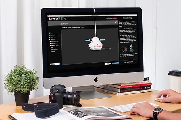
All too often, your printed photos can bear little resemblance to the digital image you see on screen. The prime culprit is your computer monitor, which is likely to need calibration. Even screens that have dedicated sRGB and Adobe RGB modes can lack accuracy, and settings can drift over time, so it’s worth investing in a calibration tool like the Datacolor SpyderX Pro or Elite.
2. Paper chemistry
There’s quite a chemistry between printer ink and photo paper. These two components are carefully formulated by inkjet printer manufacturers, so that they work together to give optimum colour and tonal accuracy, and the best definition without colours running into each other on the page. It’s best to stick with the printer maker’s own photo papers (or a directly supported alternative) to ensure the best results and resistance to fading.
 3. Liquid gold
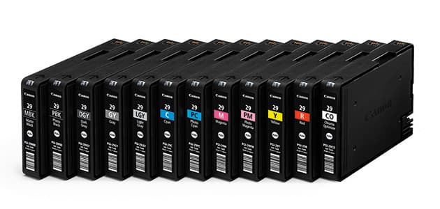
It’s often said that printer ink is more expensive per millilitre than the nest champagne or perfume, or even the cost of human blood for hospital use. It’s therefore tempting to substitute genuine ink cartridges from the likes of Epson and Canon, in favour of cheap alternatives. However, cheap inks may contain impurities that can block print head nozzles and generally result in poor colour accuracy
4. On the shelf
Communication is mostly digital these days and some of us only use a printer quite rarely. Even so, avoid leaving it on the shelf for too long, as the ink can dry in the print head nozzles and become very difficult to shift. Most inkjet printers run a mini-cleaning cycle at or shortly after switch-on, so it’s worth at least turning on your printer for a few minutes each week.
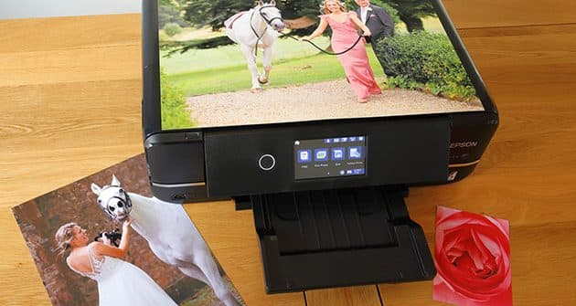
5. Supersize your photo prints
A4 prints tend to look a little lost and insignificant when hung on the wall. Trade up to an A3+ or ‘Super A3’ printer and you can create photo prints up to 19x13in (483x329mm). Top choices include Canon’s PIXMA PRO-100S and PRO-10S, which run on dye and pigment based inks respectively. The PRO-10S has a ‘chroma optimizer’ cartridge in its line-up, which enables unusually smooth output on glossy paper for a pigment-based printer.
6. Set for success
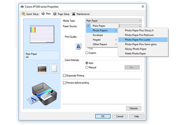
There’s not much point in using the printer manufacturer’s photo paper if you don’t tell the printer what you’re feeding into it. For example, Canon makes Photo Paper Plus Glossy II, Pro Platinum glossy, lustre, matte and fine art papers, all of which require different amounts of ink for the best and most accurate results.
7. To dye for
There’s no beating dye-based inks for smooth output on glossy paper but some A3+ and larger printers run on pigment-based inks instead. These are generally better for printing on matte and fine art media, delivering better-looking and more robust, fade-resistant results. Additional grey inks are often featured, for enhanced delity in black & white photo printing.
8. Straight and narrow
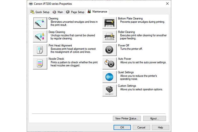
The chances are that your new printer has been bounced around quite a lot in transit, between leaving the factory and arriving at your home. A print head alignment procedure normally forms part of the initial set-up routine, and it’s best not to skip this step if you want the sharpest-looking output. It can also be worth repeating the process every few months, to maintain optimum results.
9. Nozzle check
If you notice faint lines across your photo prints, it’s likely that some of the nozzles in the print head are blocked. Run a nozzle check routine from the printer properties dialog box, or onboard menu, and select a cleaning cycle if required. Stubborn blocks may require a ‘deep cleaning’ cycle, if featured.
10. Photo printing labs
Home printing is unbeatable for immediacy but there are advantages in having your photo prints created by an online lab. There’s much more choice in sizes and aspect ratios, typically ranging up to around 60x40in poster prints. You’ll also get a wider selection of finishes to choose from, often including acrylic, aluminium Dibond, boxed canvas prints and more. Our favourite labs for large-format printing include Loxley Colour and Whitewall.
 11. No touching
Photo prints that are created with dye-based inks on glossy paper are pretty much touch-dry even as they hit the printer’s output tray. That’s because the ink passes through the paper’s protective glossy covering before fixing into the paper. Even so, it’s best to let them dry for a few minutes before touching the surface. With larger molecules that remain on the surface of the paper, pigment-based inks take much longer to dry and are prone to smudging if you touch them within a few minutes.
12. You’ve been framed
Another plus point for getting your large-format photo prints created by an online lab is that many include mounting and framing services. You can therefore get the complete, finished product delivered to your door, ready to hang on the wall. Job done!
13. Speed kills
The standard photo print quality setting should enable rapid results and is generally fine for outputting postcard-sized photo prints in just a few seconds. When printing at A4, or larger sizes if you have a bigger printer, it’s worth switching to the best quality mode. Prints may take about twice as long to create, at around two minutes for most A4 printers, but the higher resolution enables more detail, better tonal definition and smoother colour gradations.
[collection name=”medium”]
14. Photo disenchantment
Many printers use a ‘photo enhancement’ mode by default, intending to make photo prints look their best. However, the results can sometimes look over-saturated, too high in contrast, or downright lurid. It’s generally better to edit your images so they have your desired brightness, contrast and colour rendition, and to switch off any enhancements.
15. Best colour space for photo prints
The standard colour space for digital imagery is sRGB. The main alternative is Adobe RGB, which is often favoured by landscape photographers for its extended range in the cyan and green areas of the spectrum. Whichever you use, you’ll need to ensure that the printing colour space is the same as the working colour space, otherwise the results will be hugely inaccurate.
Matthew Richards began his career as a broadcast engineer for the BBC in London and for companies across Southern Africa. He then became a technical author, before moving into journalism and photography, for which he’s enjoyed assignments in the UK and worldwide. He currently specialises in reviewing cameras, lenses and photographic accessories.