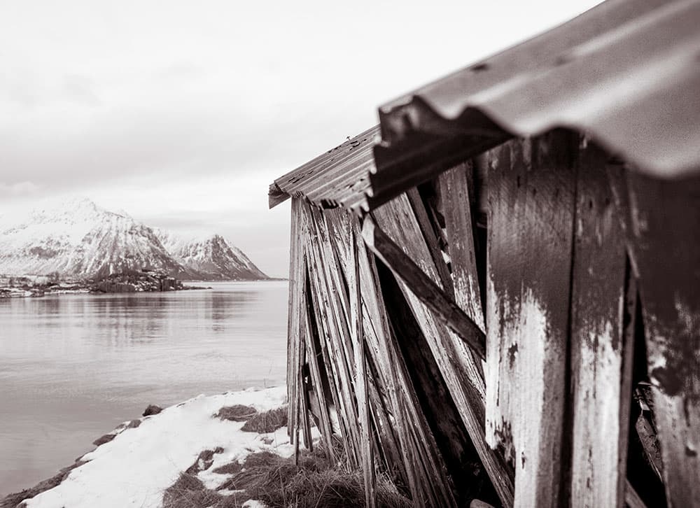
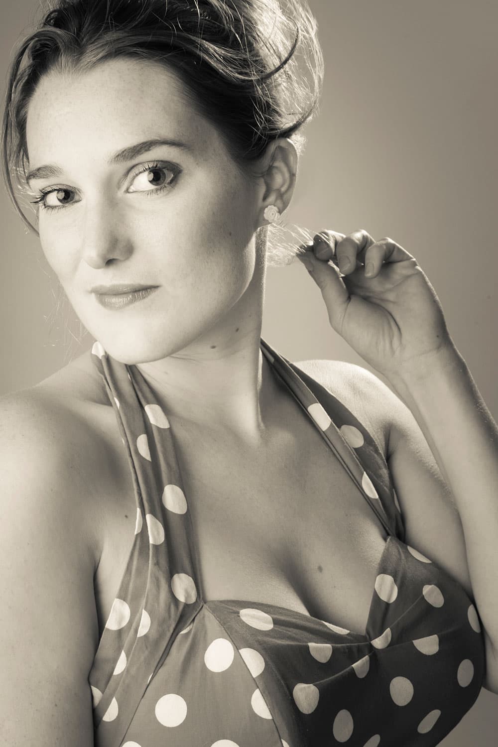
1 Apply selenium toning
In the traditional selenium process the metallic silver in a print is converted into silver selenide. The resulting colour changes range from reddish-brown to purple, depending on the strength of the solution and the type of paper. To get the selenium look in Lightroom try the in-built preset, or experiment with Split Toning.
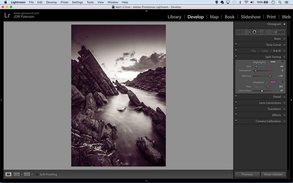
2 Convert to mono first
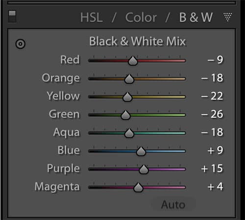
The starting point for most black & white toning effects is a finely tuned monochrome conversion. Use the B&W Panel in Lightroom’s Develop Module to convert to mono. It gives you control over the brightness of different colours. Alternatively, try the in-built black & white presets within Lightroom’s Preset Panel.
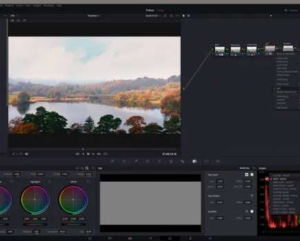
3 Curves control
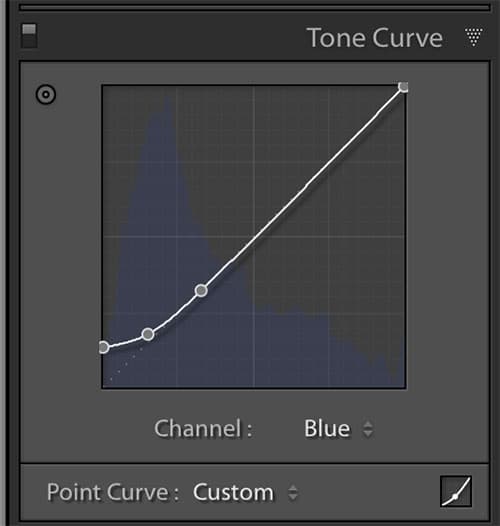
When using the tone curve different parts of the line will affect different sections of the tonal range, from the shadows (on the left side) to the highlights (on the right side).
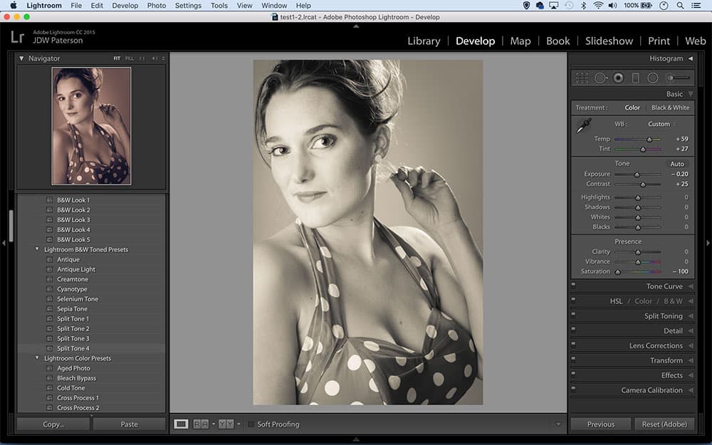
4 Two tone options
After converting to mono, there are essentially two ways to colour tone your black & white images – the Split Toning and Tone Curve Panels. If you use curves, switch on the Point Curve View (click the square icon in the corner of the panel) as this displays the Channel dropdown needed for colour changes.
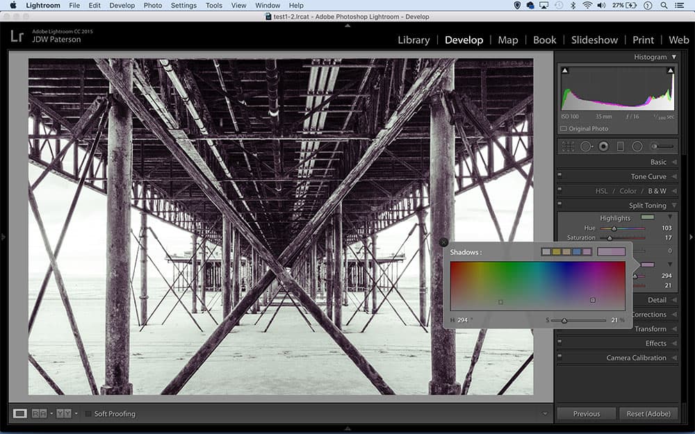
5 Helpful views
Initially when we adjust the Hue sliders in Split Toning very little happens, as they work in combination with Saturation – which by default is set to 0. However, hold Alt while dragging Hue and you’ll temporarily see saturation at 100%, which aids in selecting the right tone. Once done, we increase saturation as needed.
6 The Split Toning panel
A touch of red to the shadows can result in a classy sepia tone effect
The Split Toning panel is the easiest tool for black & white toning in Lightroom. After converting your image to mono, simply use the Hue and Saturation sliders in combination to choose colours for the shadows and highlights. The Balance slider lets you control the distribution of colour.
7 Colour box
The Split Toning panel offers a colour picker box that allows you to choose any colour you like from the chart to tone your photograph. The box also lists a few common presets at the top. Click and hold over any of the five preset colours to change the preset to the currently selected colour.
8 Strike a balance
Hold Alt and drag the Balance slider in the Split Tone Panel for a view of your Shadow and Highlight colours at full saturation, making it easier to access the results. Moving the slider right gives colour bias to the highlights, shadow bias to the left.
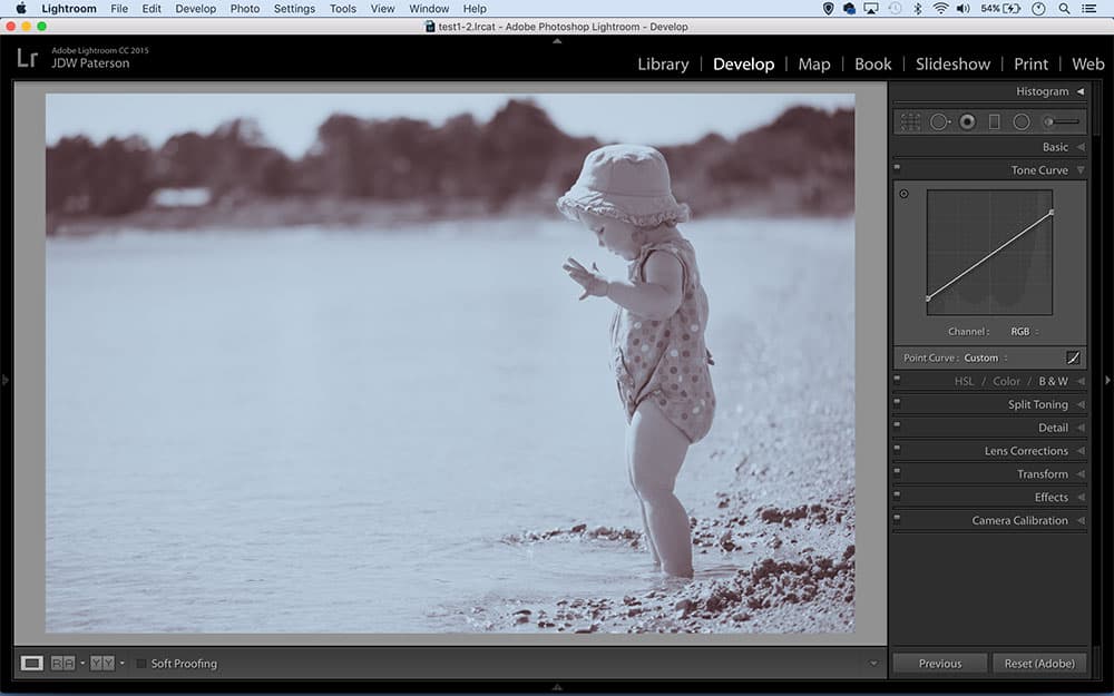
9 The Tone Curve Panel
To colour tone images with the Tone Curve, click the Channel Dropdown (when in Point Curve mode) and select red, green or blue. In the Red Channel, dragging up adds red, and down adds cyan. In the Green channel, up adds green, and down adds magenta. In the Blue channel, up adds blue, and down adds yellow.
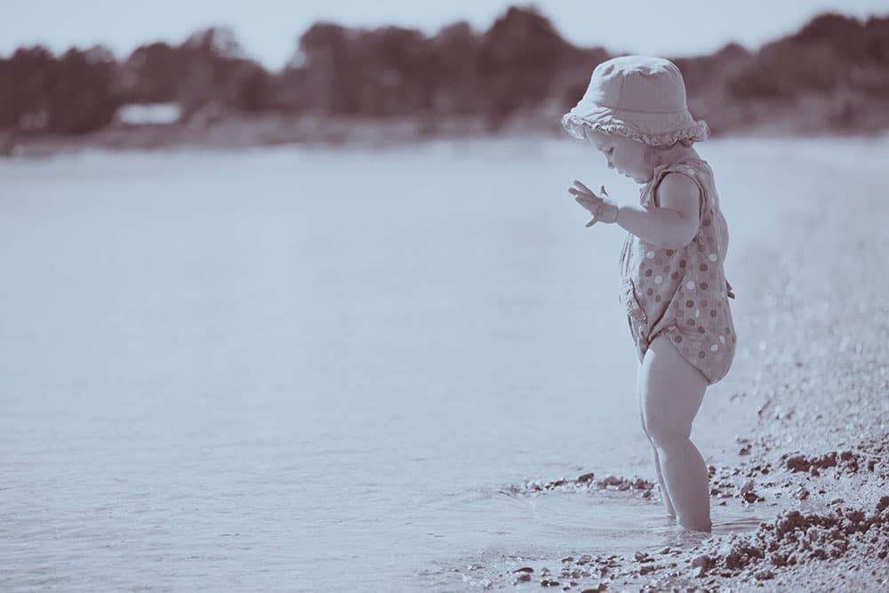
10 Create a cyanotype
Cheap, simple and stable, the cyanotype printing process results in ‘Prussian blue’ tones. Lightroom’s cyanotype preset isn’t good – so here’s a better way. Go to Split toning and set Highlights Hue 205, Saturation 15, Shadows Hue 221, Saturation 60, Balance +55. Go to the Basic Panel. Lower the whites and up the blacks.
11 One-click toning
Once you’ve selected a toning preset you can tweak the results until you get the effect you’re looking for
Presets can provide useful starting points for further edits
The Presets Panel to the right of the Develop Module houses a range of useful ‘Lightroom B&W Toned Presets’ that mimic the look of traditional analogue processes such as selenium toning and sepia toning. Even if they don’t give you the finished result you’re after, they can still be useful starting points for further edits using the controls on the right.
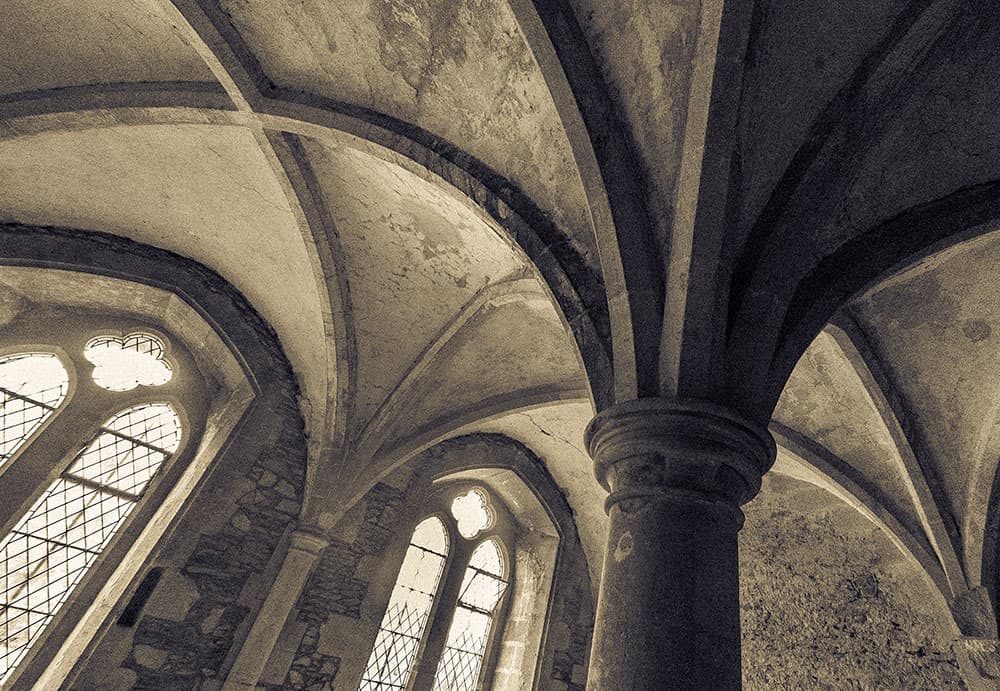
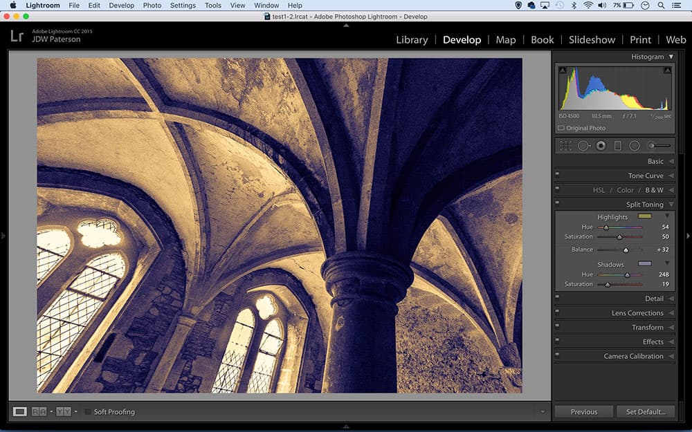
12 Vintage print toning
Adding a warm yellow tone to the highlights gives an image the look of an old print, as it mimics the way a print will age over time by gradually turning yellow. Use the Split toning Highlight controls to add a yellow tone to the highlights, then fine-tune things with the Balance slider.
13 Get the washed-out look
If you want to give an image the washed-out look of an old print, try adjusting the Tone Curve. Drag the very bottom of the diagonal curve line upwards, and drag the top right point downwards. This lifts the blacks and lowers the whites, reducing contrast for a retro feel.
14 Make your own unique presets

You can create your own colour presets
Turn your favourite colour combinations into presets by clicking the plus icon in the preset panel to the left of the Develop Module. Only check the parameters you want to include in the preset, such as the Split Tone settings, as checking all the boxes will cancel out any existing edits made to images.
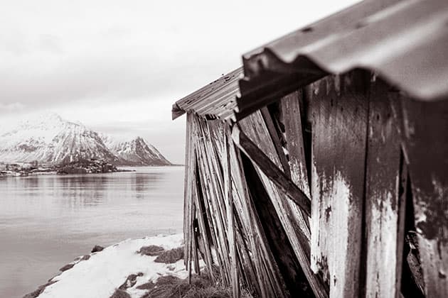
15 Control the mood
A sepia tone can create a nostalgic mood
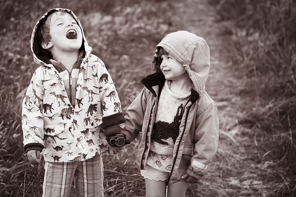
As well as learning how to add toning effects, you should also consider when and why to use them. Often a little colour can help to amplify the mood of an image, especially with portraits. A warm sepia tone creates a happy nostalgic mood; while a cool blue may give a more sombre feel.
16 Use a wet-plate border
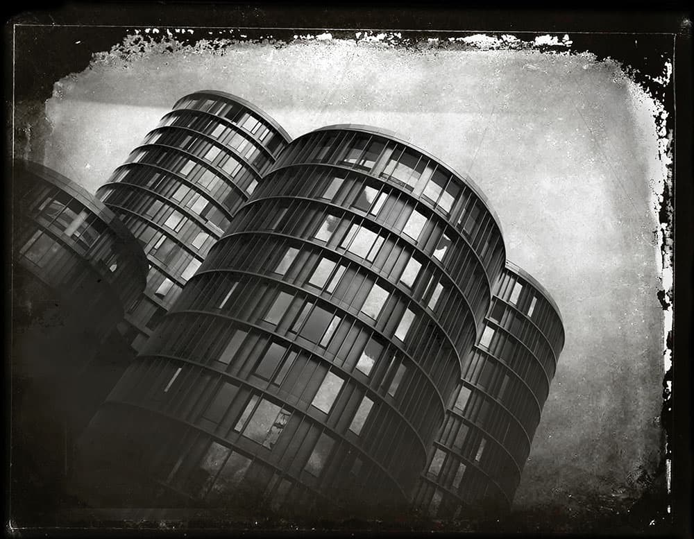
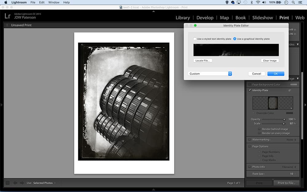
The ‘Identity Plate’ option in the Print Module’s Page Panel lets us load in a png file (a file format that preserves transparency) so we can add a messy wet plate border by dropping in a prepared file. We’ve prepared a wet_plate.png download at tiny.cc/a87nky or alternatively, you can make your own in Photoshop.
17 Enhance shadow colour
The Balance slider in Split Toning is more powerful than you might think. Try adding a colour to the shadows with high saturation. Next drag the Balance slider to the right. This suppresses the colour in the midtones but still leaves that strong saturation in the shadows, creating colour-rich dark tones.
18 Make a sepia wash
In the analogue process a sepia wash converted the print to shades of brown, and increased its longevity. For a digital version, go to the Tone Curve. Target Reds and move the bottom point up, then target Blues and move the bottom point to the right.
19 Single splits
Lightroom’s Split Toning panel may be designed to allow you to add colours to both the highlights and shadows, but often the best results come from adding a single colour to just one or the other. After adding a single colour, try adjusting the Balance slider to tweak how the effect plays across the tonal range.
20 Make a border
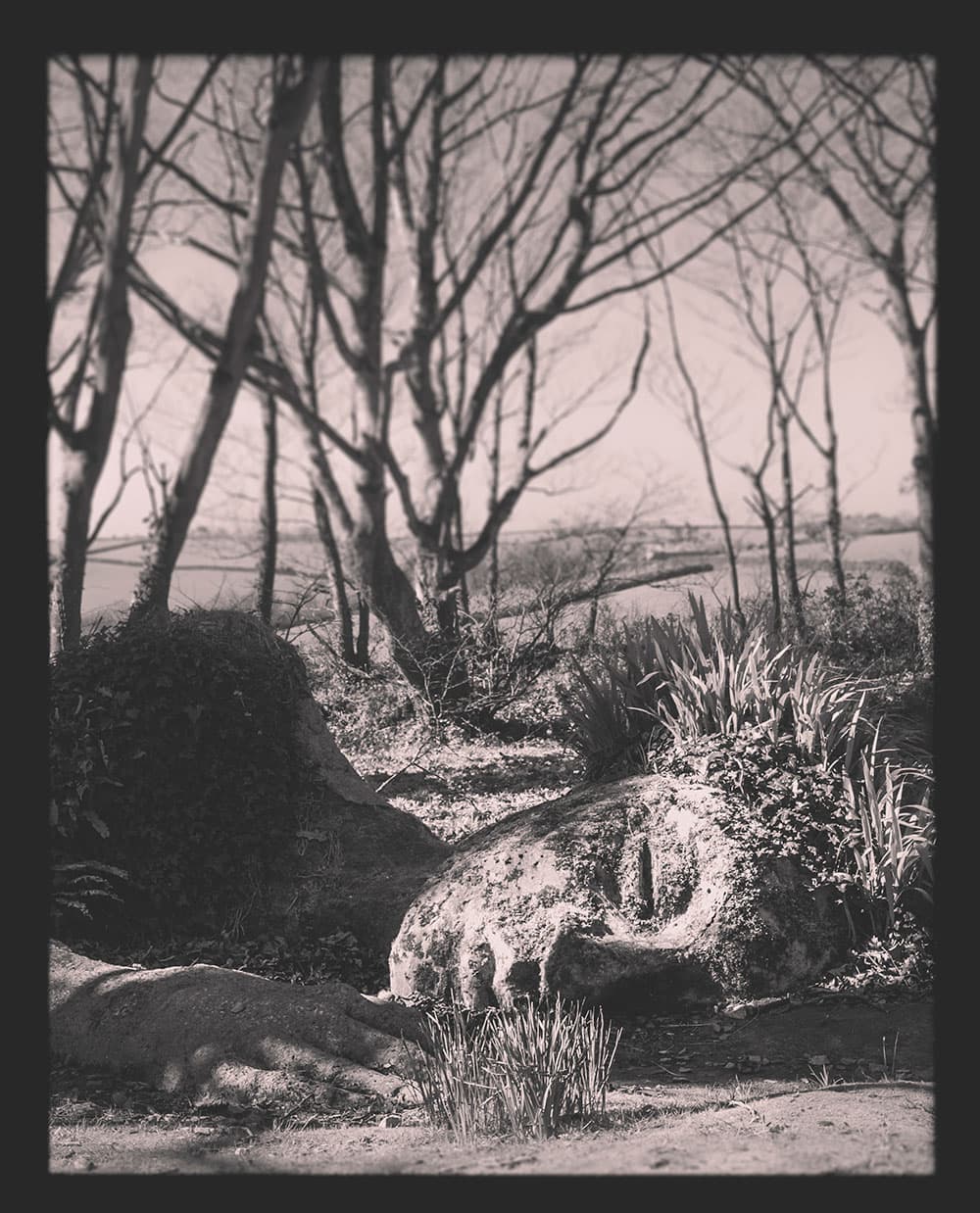
Borders go well with toning treatments
To create a simple rough border that goes nicely with toning treatments, grab the Graduated Filter tool and load it with -4.0 exposure, then drag a tiny gradient near the edge of the frame. Move to the next edge and add another, then keep going around the edges a few times until the border is complete.
James Paterson
James Paterson is as skilled a photo editor as he is a photographer. His work has appeared in countless magazines and books, and in 2014 he was appointed editor of Practical Photoshop magazine. His subjects range from portraits to landscapes, architecture and underwater scenes. For James, Photoshop is more than just a work tool. Visit www.patersonphotos.com