See the forum October 2014 competition results – Breaking the Rules
Well, this was a tricky one to judge. How do you judge the merits of shots that deliberately break the rules of photography and are in some cases intentionally bad? It’s not easy but in many cases the mistakes, deliberate or otherwise, have added a visual dimension to the images that has elevated them to something rather beautiful. We can see many examples of this, particularly in this month’s top three.
While I don’t often talk about honourable mentions, I will highlight one shot that didn’t make it into the top three but caught my attention nonetheless. There were a couple of portrait shots that I was particularly fond of. One made it into our number-three spot. The other just missed out (although I suppose you could always look at it as my unofficial selection for fourth place).
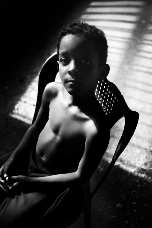
Image by Jürgen Warschun
Jürgen Warschun’s image ‘Don’t use ISO 6400 for portraits!’ was a great entry. There are a number of things I like about it. I especially enjoy the fact that he has shot it on ISO 6400 and it still looks good. Not only that, but he has used the available light to illuminate his subject. The imperfection of the chair also seems to work beautifully. The fact that the back is broken means we have the necessary space behind it to appreciate the light falling on the ground. The subject is also nicely posed, a factor further emphasised by the angle at which Jürgen has shot his subject.
Anyway, with that out of the way, let’s look at the top three.

Contents not included
Prize applies to UK & EU residents only
Our first prize winner receives a Manfrotto Active Backpack I. The bag is a structurally sound, high-capacity yet compact rucksack that can also be used as a standard daypack. With its capacity to hold a DSLR system with 2 standard lenses, 15″ laptop as well as personal items and accessories. The bag has four zippered compartments with the top part designed for personal items and the bottom for photo gear.
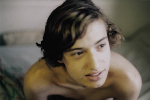
Photo by Miriamw
3rd Place
Miriamw – Lewis
I like this image a lot. There’s so much wrong with it, but somehow it still works. As Miriamw says, it is badly composed and seriously out of focus. The image is shot on a Minolta XD-7 with Fujifilm ISO 200 film. I didn’t realise it was shot on film when I first saw the image, but something about it just screams analogue 35mm film. It’s the haziness of the image, I think. Because of the rise of retro filters on smartphones and plastic cameras like the Diana, these are the aesthetic quirks we now associate with film. It also reminds me of a photo-realistic painting. The further away you are the sharper it seems. But as you get closer and closer, you begin to notice the brushstrokes and minuscule imperfections. It’s a dreamy aesthetic that appeals to me greatly and that’s why I had to have this one in my top three.
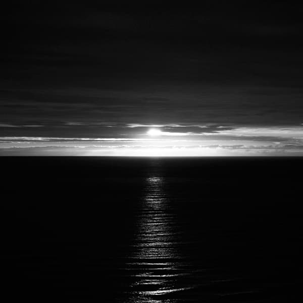
Photo by Craig20264
2nd Place
Craig20264 – ‘Sunrise’
At the other end of the scale we have this dramatic look at the sun rising over the ocean. While I do enjoy the dreamy and whimsical aesthetic of some images (as previously discussed), there’s something about an atmospheric and grainy black & white shot that appeals to my moodier side. It’s a shot that speaks to my id – the chaotic and more primal part of my mind. So what’s wrong with it? There’s very little detail and the exposure balance is all off. But that’s what makes it great. While Craig20264 may have sacrificed the details in the clouds, he has given us a beautiful strip of light in the water. It’s a stunning element of the image. The ocean almost looks like a close-up of wrinkled skin. I wish more landscape photographers would produce images like this.
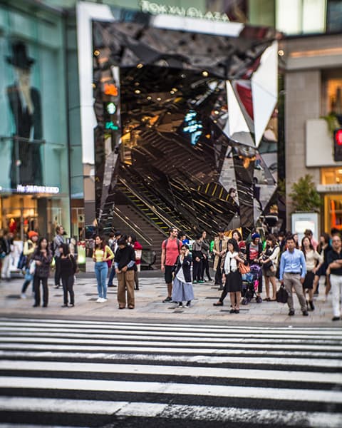
Photo by Zou
1st Place
Zou – ‘Tokyu Plaza’
This is an absolutely maddening shot! I have absolutely no idea where to look. As soon as my gaze rests on one thing, it’s pulled up or across towards something else. While that should be a bad thing, I can’t help but love the image for just for that reason. It’s the structure in the background that really makes it. The reflections are utterly disorientating. Then we have the lines on the road. The angle is all off, meaning there’s no way they can function as a comfortable framing device or leading line. Add to that the surreal focusing and you have a shot that can easily make the viewer a little woozy. But again, I can’t help but love it. Zou’s image made me confused, then pleased, then a bit angry before going back to confused. I’m not sure where I am with it now. But for that very reason, I have to award it first place.
Find out how to enter the 2014 competition
Look at all the entries for this round
Read all comments for this round
Leave your comments for winning pictures for this round