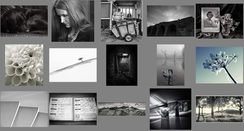
Forum competition results – December
2012 – Where’s the Colour Gone?
For
this month’s round we asked you a rather cryptic question: ‘Where’s the Colour
Gone?’ We wanted entrants to explore, not just the wonderful world of
monochrome, but also to see where you can find natural occurrences of
washed-out and muted colour. It’s perhaps not an easy theme to grasp but
judging by the results we received, a lot of you gave it a pretty good go.
Samsung has kindly provided a 32GB Micro SD card, with SD adapter for the winner, and 8GB cards and adapters for the second and third places. Second and third places also get an Amateur Photographer Loves My Pictures mug.
The
most important thing to consider was the subject. What does a lack of colour
communicate to the viewer about what we’re seeing? This is particularly
important when choosing to either shoot in black & white or making the
decision to convert the shot to monochrome post capture. Colour, or a lack of
it, can of course be an aesthetic consideration but it must also have a reason
for being. One entrant who understood this was AndrewBeasley whose shot of a
sheep walking along the edge of a great wall was full of atmosphere.
Another
particular favourite was caledonia84’s – “Somewhere I Shouldn’t Be”. It was the
title of this shot that got my attention. There’s nothing more exciting than
being somewhere forbidden, knowing that you’re breaking the rules all in the
name of adventure. We all did it as kids. In fact, some of us never grow out of
it. I recently found myself in a position where I was able to sneak into the
main boardroom of the BBC and sit at the head of perhaps the most expensive
table I’ve ever seen. That was pretty exciting, I can tell you. The use of monochrome
in caledona84’s image is great. This is a location where the light barely
penetrates the enclosure. I don’t know where it is, but I know it’s somewhere
I’d love to visit. Remember, it’s in the nature of the photographer to explore.
Of
the entrants who shot in colour, a particular stand-out was plasticflower with
his shot ‘Winterized’. It’s a gentle and beautiful image and came very close to
being in the top three. Other entrants of particular note were lisadb, johndow
(this one struck a particular chord with some of you) and daft_biker.
The ‘Where’s the Colour
Gone?’ round was a great one to judge (my first one in fact) and I can’t wait to see what
you all come up with in the next 12 months. Thanks to everyone for taking part.

3rd
place
Devon_Eric
– “Holga in Berlin”
Our
third-place winner is perhaps going to be controversial, but it raises an
interesting point. Take a look at Adam Irving’s Backchat letter published in
the Jan 26 issue and you’ll get an idea of the potential bone of contention.
Lomography
is not going anywhere any time soon. Nor should it. The imperfections of the
images produced by these cameras are not to everyone’s taste but to those
people who accept the unpredictability of the results the pictures they achieve
are a constant source of excitement.
It
should go without saying that architectural photography must do more than
simply record a space – it should draw out the character. This image was taken
inside the Daniel Libeskin designed Jewish Museum in Berlin. The building
itself can be overwhelming in its angular irregularities and various corridors
and Devon_Eric has given us a sense of this by producing a double-exposure shot
(presumably using 120 film judging by the shape of the frame). Crucially we can
see that the use of monochrome has emphasised the graphic shapes of the
building. Our attention is drawn to the lines and blocks and held there. We’re
not distracted by the intrusion of colour. The grain too is important in that
it adds texture.
An
argument could be made that Devon_Eric didn’t need to use a Holga camera to
produce this shot, but the fact is he did and this is what he got. Much in the
same way that an artist has a range of choices at his disposal – oils,
watercolour, pastels, charcoal – so too does the photographer: 35mm, medium
format, smartphones and toy cameras and so on – each is equally capable of
achieving captivating results. I think Devon_Eric’s Holga image is really quite
brilliant.

2nd
place
miked
– “Long ago and far away”
I’m
going to be honest with you here – this shot didn’t particularly grab me when I
first saw it. I don’t know why but somehow it just got overlooked. It was only
after sitting down and staring at it that the power of the image really hit me.
A great piece of work is one that takes time to digest. It has to sit and
percolate in the subconscious for a while.
This
is a genuinely beautiful image and a really original interpretation of the
brief. Maybe I’m reading too much into this but the lack of colour seems to be
communicating the years passing by and feelings of personal loss. The photo,
the ring and necklace suggest to us that the photographer has lost someone
close to them. Without them the colour has drained from their lives. The
withering flowers suggest impermanence. Nothing lasts forever. It would be easy
to read this in melancholy terms. I don’t. I think it’s very beautiful.

1st
place
JaySteel – Winter Swan”
Swan’s
seem to be a recurring theme in the art of the Western world. It began all the
way in the 1500s when Leonardo da Vinci produced his now lost painting of the
story of Leda and the Swan. Ever since then the brilliant white bird has popped
up time and again making it a enduring symbol and subject. They’re undoubtedly
a popular theme in photography too. Take a look at the wildlife photography of
Alex Saberi for a good example.
I
have to say this image leapt out at me right from the start. I’m a sucker for
fairy tales. As a child I wasted many an evening devouring the stories of the
Brothers Grimm, Angela Carter and Hans Christian Anderson. It’s difficult not
to look at this image and feel like a child again. The image is saturated in
atmosphere. It almost seems to be from another world entirely. I just love the
mist, the swan, the hazy sun and the trees that look like twisted hands. It’s
only when you notice the park bench in the background that you realise the kind
of location this was taken in.
For
my money this is great interpretation of the brief. When faced with the title
‘Where’s the Colour Gone?’ the obvious choice would be to produce a monochrome
image. But here we see that JaySteel (and a few of our other submissions) chose
to take a different approach. The autumn and winter months seem to drain the
colour from the environment and leave behind washed-out, murky tones. The mist
creeps into the landscape and obscures the horizon, rendering the objects there
as barely in-focus silhouettes. Look to the sky and you can see the sun
fighting a losing battle against a ground level ocean of grey.
The
compositional balance of the image is subtle but effective. It’s the
reflections of the trees and the hook of the swans neck and head that hold
everything in place. Perhaps there could have been a little more space between
the edge of the frame and the swan’s reflection but that’s a minor quibble. The
fact is, it works.
All
in all this is a shot that I’m very fond of and is, in my opinion, a more than
worthy taker of the number one spot of this particular round. Congratulations
to JaySteel.
Enter our January 2013 competition here
See all the entries for this round
See the comments for this round
Leave your comments for the winning pictures here
AP Forum competition results – sponsored by Samsung
![]()