Toning originates from the days of film photography and darkroom processing. During the early stages of the medium, printed images were delicate and prone to fading from physical touch, atmosphere and light even after development. Photographers wanted to increase the longevity of their black and white images and as the medium evolved, toners were introduced to the darkroom printing process. By using chemical toners such as sepia, selenium and gold, they were able to replace the silver in the print for longer-lasting results.
Using such toners however, did come with a compromise. Images were tinted with a small amount of colour. Sepia toning gave images a yellow/brown tint, while selenium introduced a blue or purple tone and gold produced prints with a blue tint. If you applied gold to a previously sepia toned image, it would give a red tint. Soon these colours played an important role in portraying emotion and atmosphere into the finished print.
Aside from the colour tints and additional time required to incorporate these toners, using such chemicals in a darkroom did prove rather hazardous. Fortunately for us, like many other traditional darkroom processes, toning can be easily replicated in software such as Adobe Lightroom.
Convert to mono first
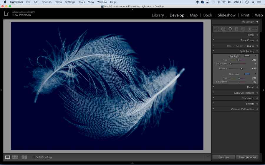
The starting point for most black & white toning effects is a finely tuned monochrome conversion. Use the B&W Panel in Lightroom’s Develop Module to convert to mono. It gives you control over the brightness of different colours. Alternatively, try the in-built black & white presets within Lightroom’s Preset Panel.
After converting to mono, there are essentially two ways to colour tone your black and white images – the Split Toning and Tone Curve Panels. To find out how and learn some other tips and tricks, James Paterson explains all you need to know in this video…
For more info and power tips, see the full feature in our June 3 issue, click here to buy it now.
https://link.brightcove.com/services/player/?bctid=5462555718001