Lee Acaster
Lee is an amateur photographer based in East Anglia with a love of landscapes. He is widely published and has won numerous national awards, including AP’s Amateur Photographer of the Year 2015 competition. www.leeacaster.com
Although I always aim to capture the image as well as possible in-camera, I see processing as an essential part of the creative process. The vast majority of my work is done in Adobe Lightroom, occasionally using Photoshop for cloning or blending images. Rather than slavishly capturing reality, I’m much more interested in making an image that is evocative of how it felt to be there when I took it, or one that conveys the vision I had in mind at the time. I use various techniques to achieve this, such as split toning, radial filters and gradients, which are all great for enhancing the mood of an image.
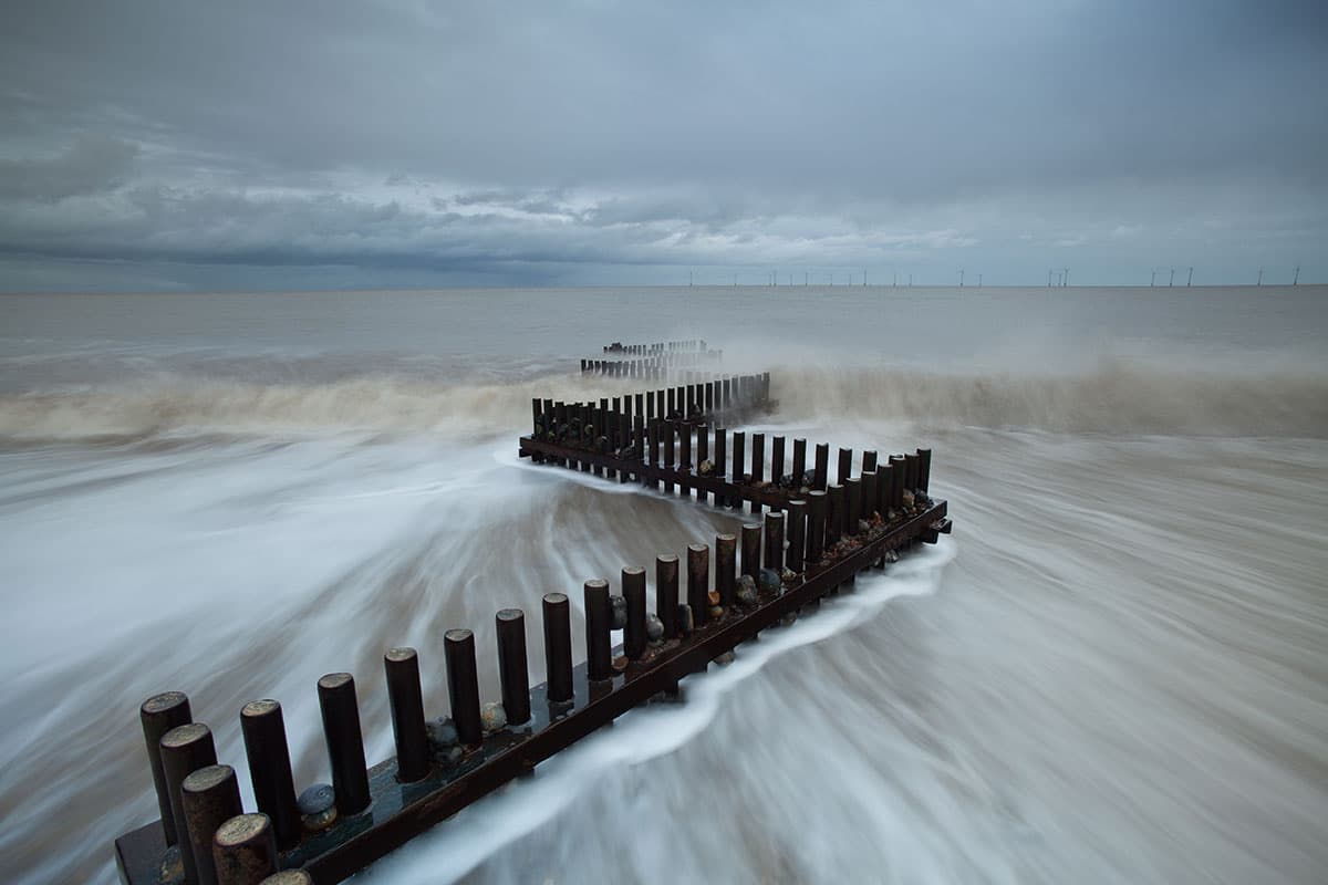
Before
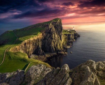
I love the zigzag shapes of the sea defences at Caister-on-Sea in Norfolk, where this shot was taken. It was a wintry morning just after dawn and the sky was suitably dramatic, but there wasn’t much in the way of light so the sea looked a murky-brown colour. I wanted the image to have more of a sense of the cold blues I remembered at the time, to help portray the feeling of the cold wintry morning by the sea.
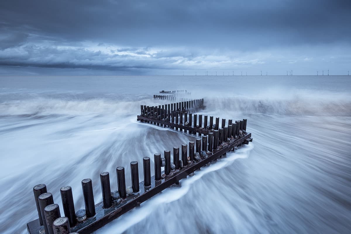
After
Lee’s step-by-step tutorial
1. Add keywords
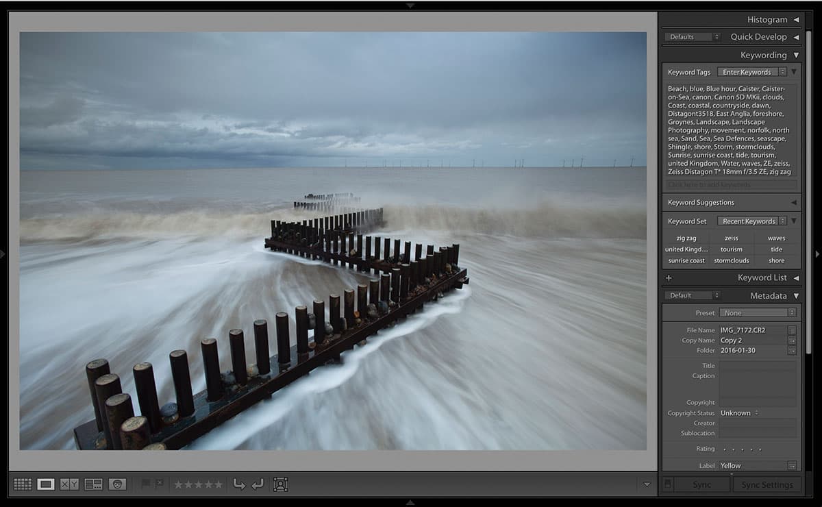
The first step I take is to add keywords as I import a shot into Lightroom, saving time on what can be a tedious job later. I have various lists relating to different lenses, locations and times of day, which I then copy and paste accordingly, adding more specific ones as required.
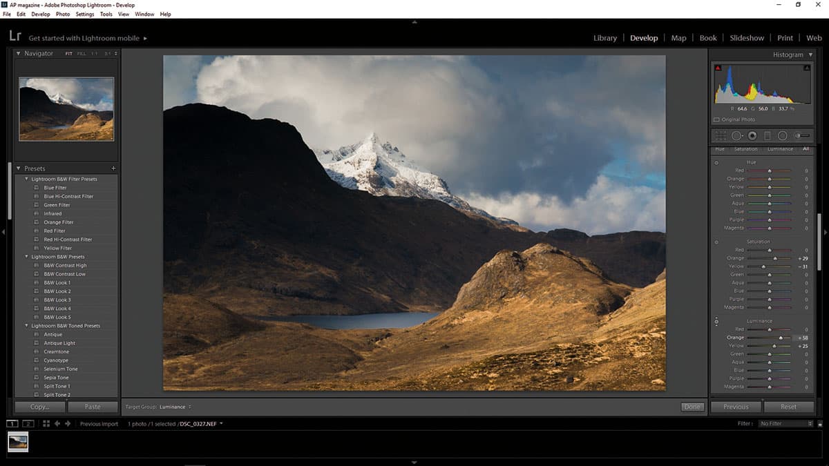
2. Tonal adjustments
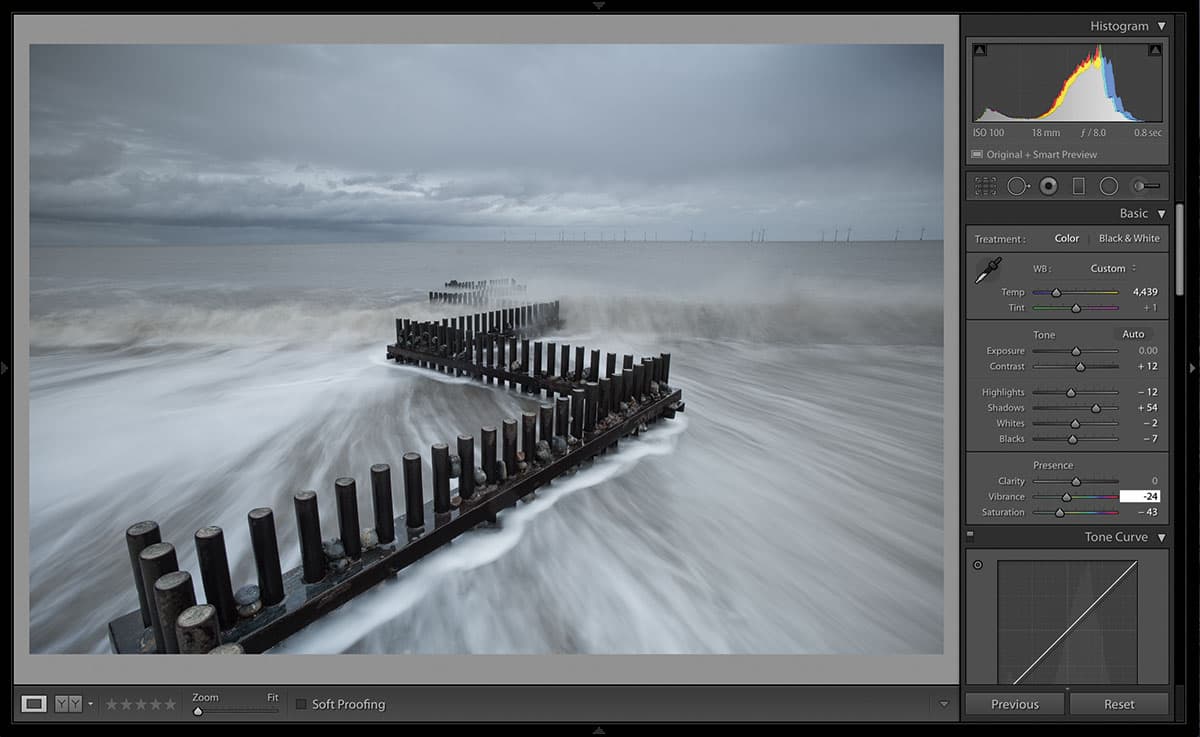
Next I work down the Develop menu from top to bottom, starting with Basic tonal adjustments. For this image, I began by adjusting the White Balance to be colder, then lifted the Shadows to show the detail on the groyne. I reduced the Saturation quite significantly to give a more harmonious starting point to work from.
3. Split toning
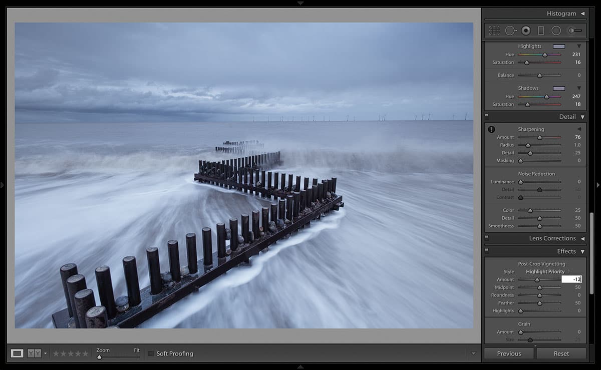
Moving down the menu, I sharpened the image, then applied some split toning, which I use a lot. I find it can tie the colours in a shot together, and also convey a sense of mood. Some experimentation is usually required, but I’ll start by setting the Saturation sliders to 15 and then adjust the colours of the Highlights and Shadows until I’m happy.
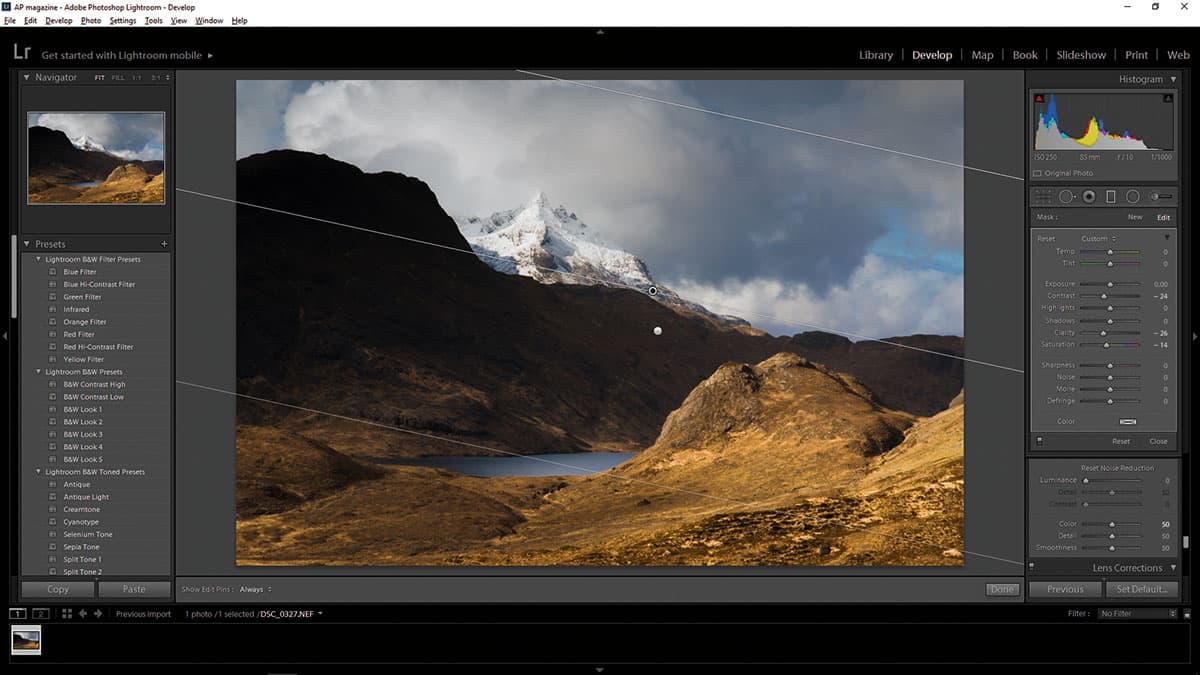
4. Gradient filters
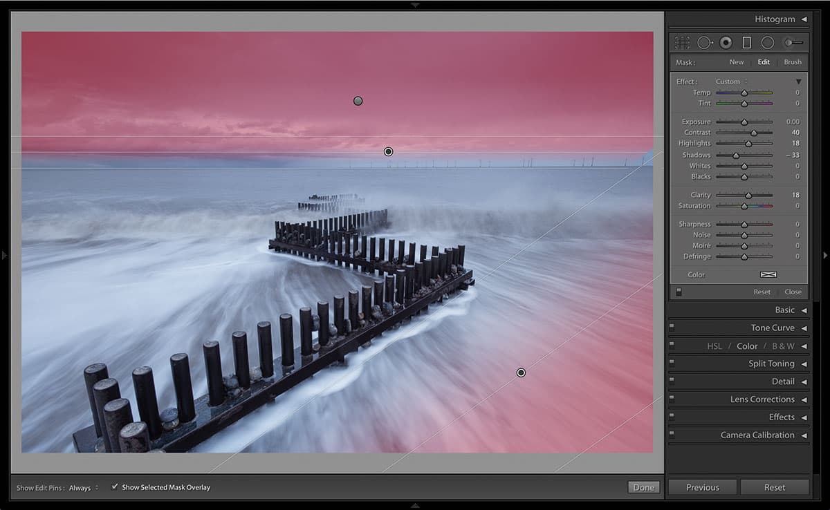
Now it’s time to add some gradient filters, which I find are particularly useful for drawing the eye into the image. Here I’ve used one on the bottom corner to darken a light area of sea, and a couple on the sky to increase the contrast there and darken the image towards the top.
5. Radial filters
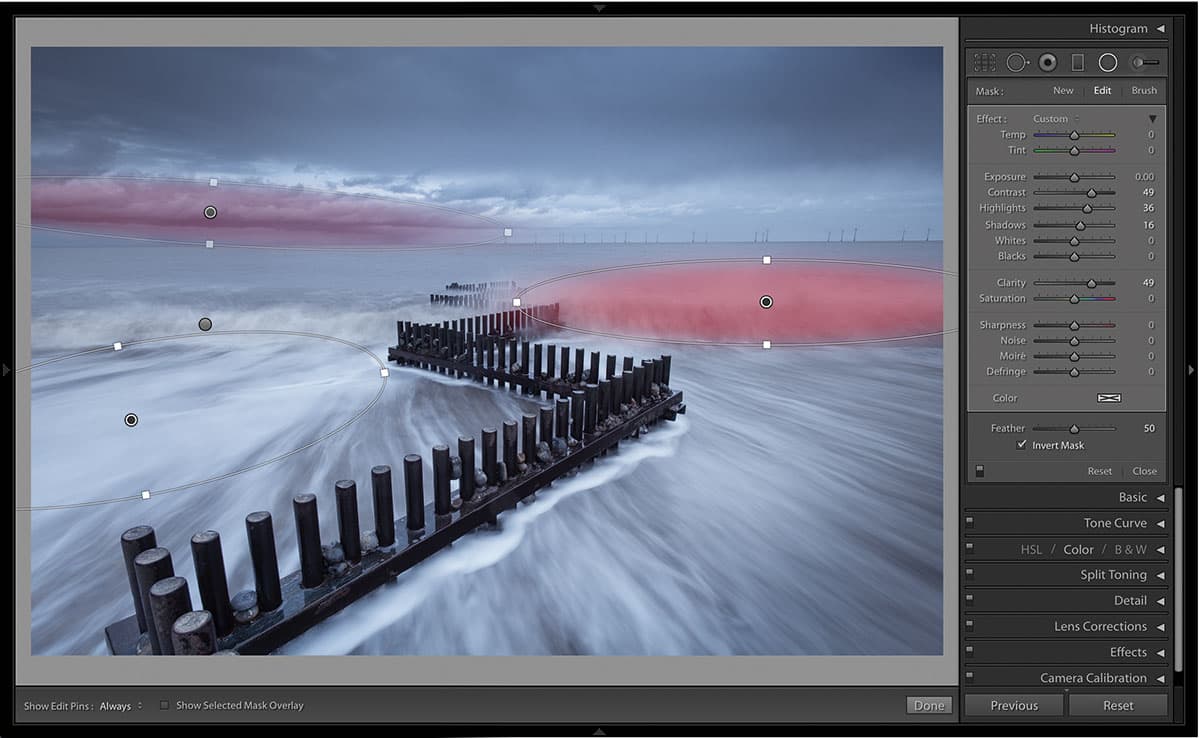
The radial filters work in the same way, but can be used to target more specific areas of the shot. I’ve used them here to enhance the detail and add some more accurate tonal work into particular areas of the sky and sea.
6. Correct verticals
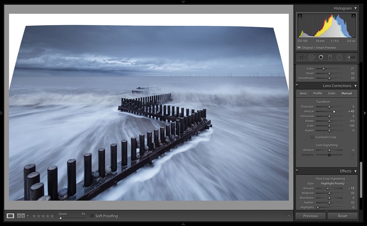
Usually I would just correct the verticals caused by the wideangle lens on the original, but in this case I don’t want to lose the dynamism of the foreground angles, so I created a Virtual Copy in the drop-down Photo menu. I then corrected the verticals of the turbines on this copy.
7. Layer mask
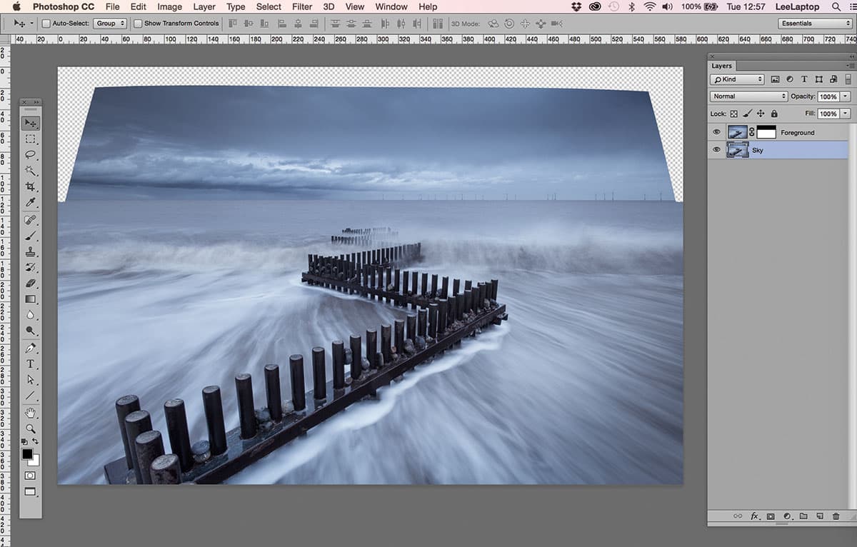
Selecting both the virtual copy and the original, I then opened them as Layers in the same document in Photoshop, with the corrected image at the bottom. I added a layer mask to the top layer and, using the Gradient tool to ensure a soft edge, I masked the sky fractionally below the horizon.
8. Eliminate empty areas
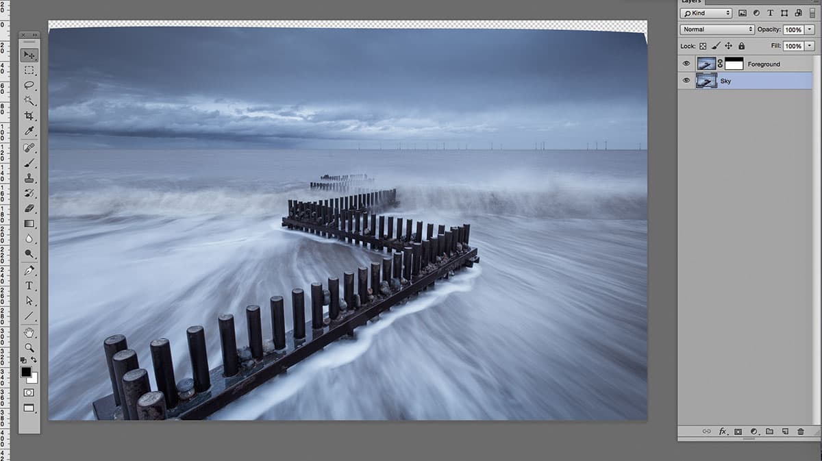
Switching to the corrected layer, I scaled the image of the sky up to eliminate the empty areas caused by the vertical correction, and lined up the horizon to its original position, then flattened and closed the image.
9. Final tweaks
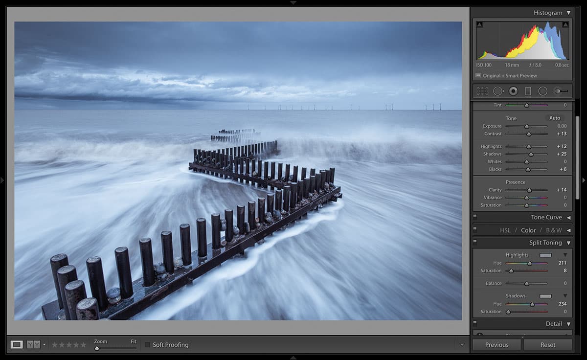
With the final image now back in Lightroom, I made a few final tweaks, using the Clone tool to remove dust spots, slightly adjusting the contrast and shadows, along with adding a touch more colour to the shadows with split toning.
Mark Littlejohn
Mark found photography late in life, but has been making up for lost time ever since. He’s happiest wandering in the Eden Valley or around Ullswater in Cumbria with a camera in hand, waiting for the adrenaline rush of capturing that next beautiful moment. www.markljphotography.co.uk
Processing landscape images can be a very personal thing. Some people like to leave their images almost untouched and present them nearly straight out of camera. Others like to perform innumerable alterations with a variety of selections, masks and layers in Photoshop. I sit somewhere between the two. I process my colour images using mainly Lightroom, and my black & white images with a combination of both Lightroom and Silver Efex. I use Photoshop to finish them, but in all cases I only carry out general alterations and make no ‘selective’ processing.
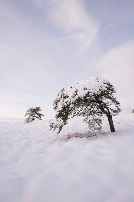
Before
My only aim when processing an image is to enhance what I perceive to be the essence of the atmosphere within that image. There has to be something within the scene that attracted me to it in the first place and it is that aspect I am trying to ‘improve’. It might be by the use of split toning and on other occasions, as with the image here, it might be a soft conversion to black & white.
Snow-covered scenes have a quieter, more reflective mood that I find well suited to soft grey processing. This is more of a fine-art look that sits well with a square crop, once you have decided the best place to crop it. Most alterations in this type of image tend to be slight, gentle alterations. Too heavy a hand can ruin the softness of the mood.
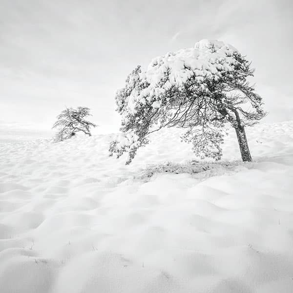
After
At each stage I try to remain gentle with an image. I would always guard against making alterations that are too noticeable and that may cause artefacts or other issues with the final image. I would far rather that when you look at the different stages (other than the black & white conversion) it is quite hard to notice the alterations.
Mark’s step-by-step tutorial
1. Import into Lightroom
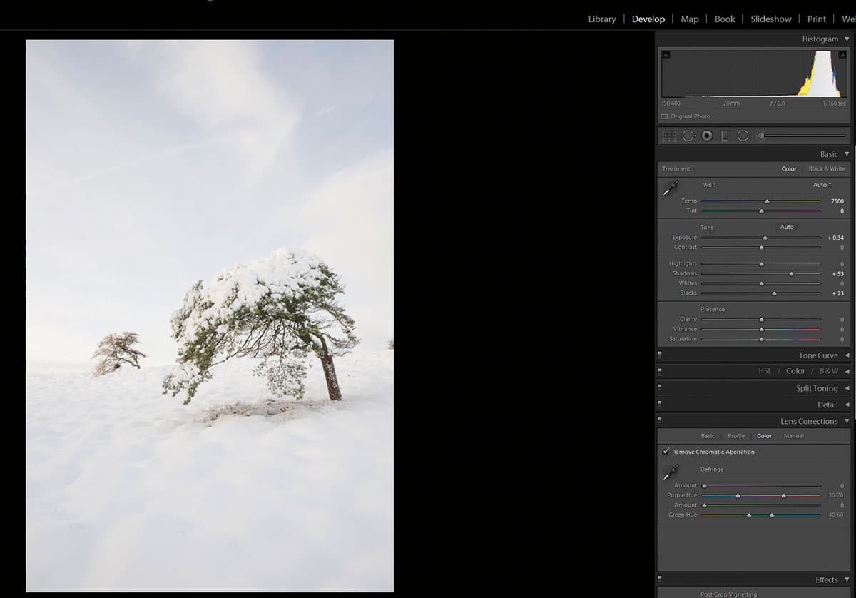
Prior to making any changes in Silver Efex Pro, I assess the image for highlights and shadows. I don’t make any alterations other than those. I don’t crop at this stage, either. If I crop before editing in Silver Efex Pro, I can’t change my mind at a later date without starting the whole process again. I will also make any corrections for the likes of chromatic aberration at this stage as well.
2. Transfer to Silver Efex Pro
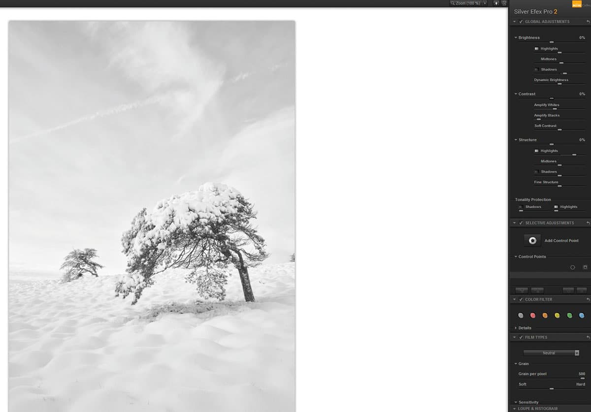
With the image transferred to Silver Efex Pro as a TIFF file, I don’t make massive alterations here, as it can be quite destructive. In this instance, I have increased the structure in the highlights to emphasise the small mounds in the snow in the foreground and the light, fluffy sky, amplified the whites in the contrast panel and the dark contrast by slightly less. The image is then saved and brought back into Lightroom as a TIFF.
3. Crop the image
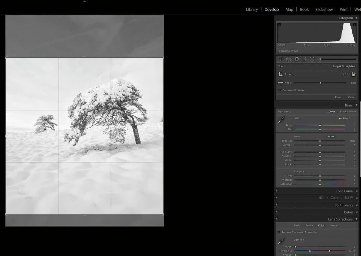
Once the image is back in Lightroom, I can now decide where to crop it. The image suits a square, but deciding where to crop a square with such minimal content is a very personal choice. More sky or more land? I rather like the curves in the snow and the diagonal flow from top right to bottom left, hence my decision to have the horizon slightly above the centre.
4. Matching tones
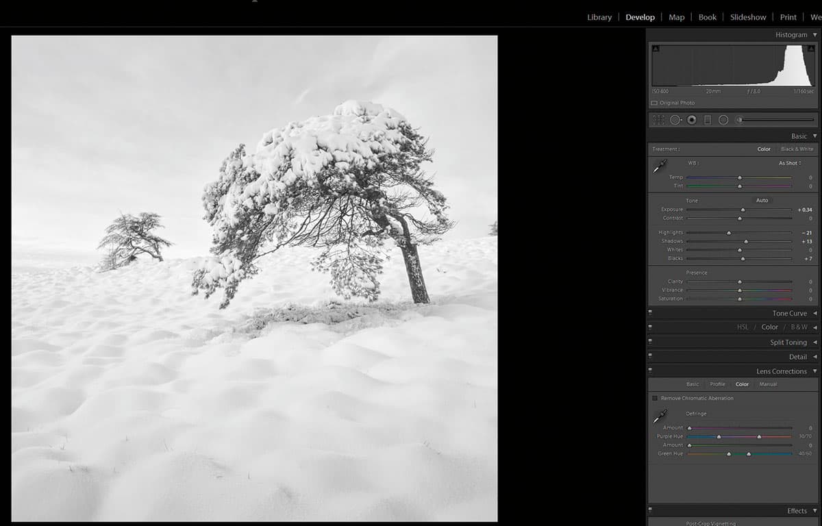
I want a high-key image, so to reduce the darkness in the tree trunk a slight recovery in both the Shadows and Blacks is needed. To ensure this doesn’t lead to the highlights becoming too bright, I have recovered some Highlight detail. A graduated filter is applied on the sky, lowering exposure and recovering further highlight detail. I have also applied a gradient from the bottom, accentuating the detail in the small humps.
5. Duotone
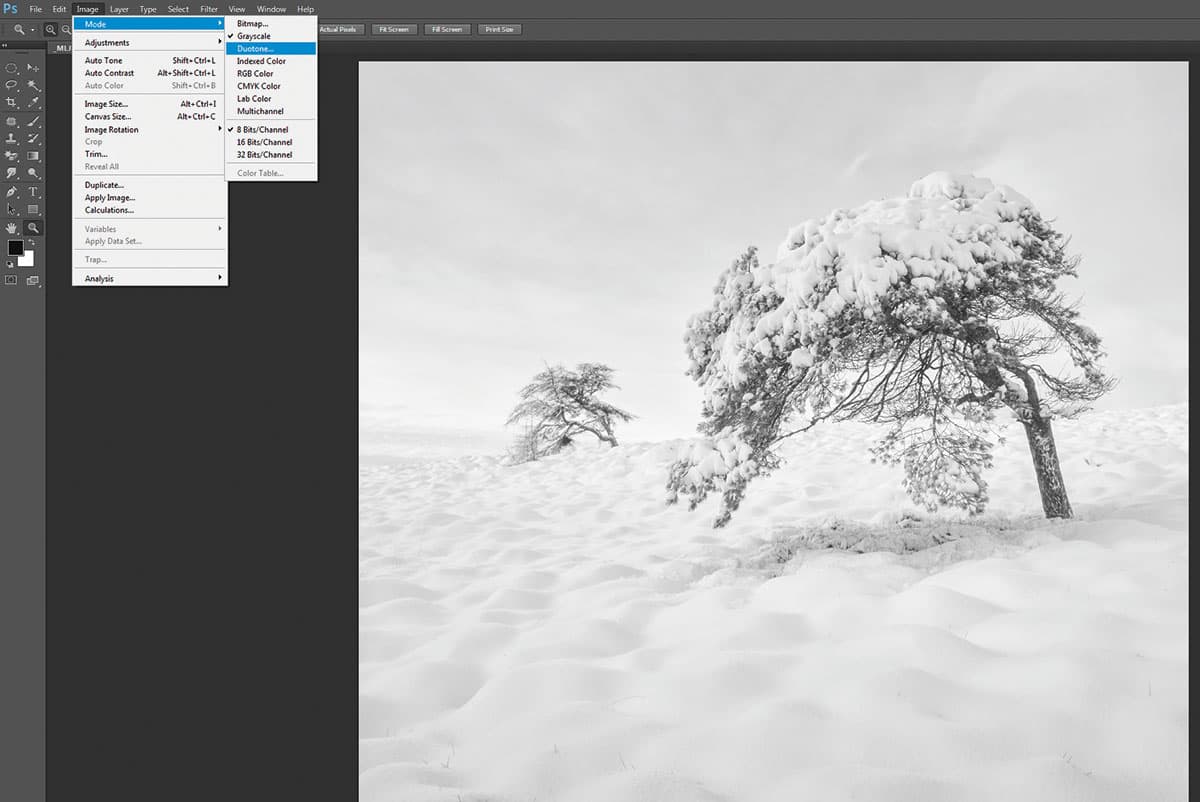
I now clone out any detail that compromises the image in Photoshop, in this case the little bush on the right edge. I like to use Photoshop for b&w toning, so with the image converted to Grayscale, I then go to Image>Mode>Duotones, where the pop-up box offers a huge range of options. For pale high-key monos, I like a soft grey tritone. The image is then converted back to RGB before saving into Lightroom.
6. Add a vignette
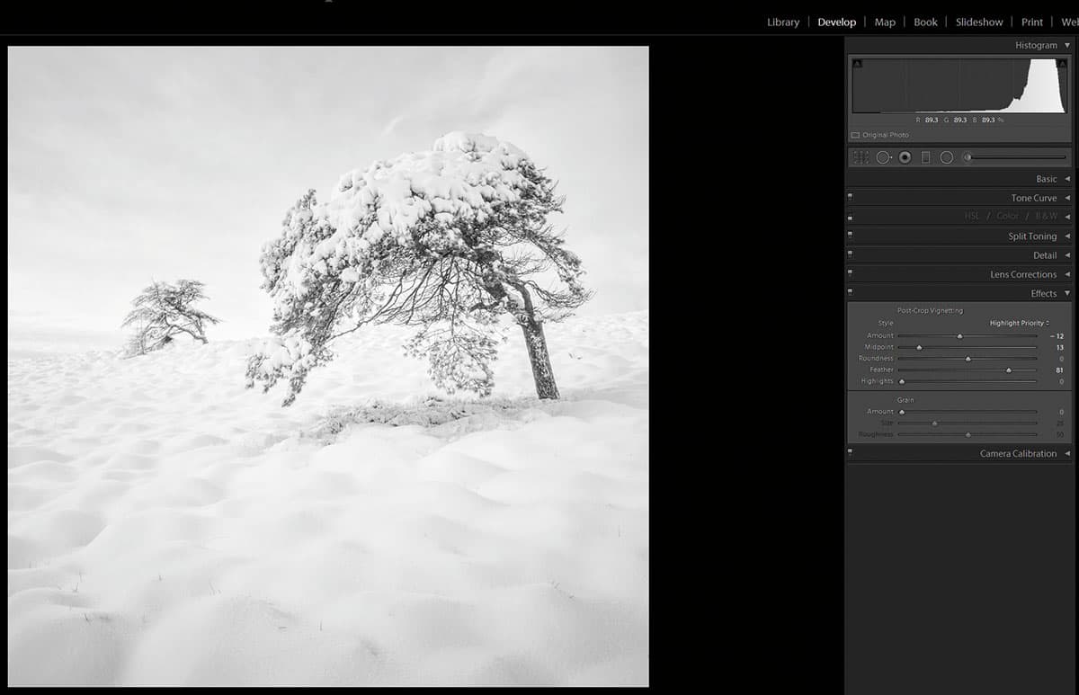
I can now make the final adjustments, in this instance I have applied a slight vignette. I normally set the Feather control to zero while adjusting the vignette. It makes it easier to decide where and how strong I wish the vignette to be. Once the vignette is applied, a final decision is made regarding the overall brightness of the image (vignette can darken considerably) and once done the image is finished.
Damian Shields
Damian has been shooting Scotland’s evocative landscape for nearly a decade. He’s drawn to the way different qualities of light can transform its character and aims to produce an emotional response in his interpretation of it. www.damianshields.com
In this blossoming era of digital photography’s evolution there are so many processes available between capture and print. The myriad options given to us in software for translating ‘what the sensor saw’ can sometimes distract us from the path to resolving a definitive version of an image, and subsequently from developing a definitive ‘style’.
I am guilty as charged of ‘over-cooking’ in the early years of landscape work, often hitting everything with the heavy hammer of saturation and contrast in the quest for a ‘wow’ image. These days, however, I take a more subtle and considered approach that means not making changes purely for their own sake – I have to justify to myself every one that I make.
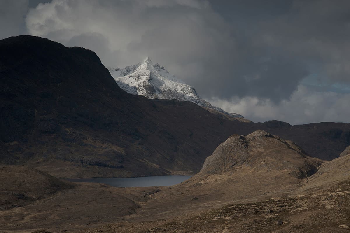
Before
I am striving for an ‘impressionistic’ approach, where the scene exists in my memory, as opposed to the veracity of a documentary reality. Throughout the time spent on my images I am always conscious of appealing to my own sensibilities first and foremost. I’m not interested in digital ‘fads’ any more, or trying to replicate the work of popular landscape shooters in the pursuit of social recognition. If people like what I do, that’s a happy bonus, but not the driving force behind what I do.
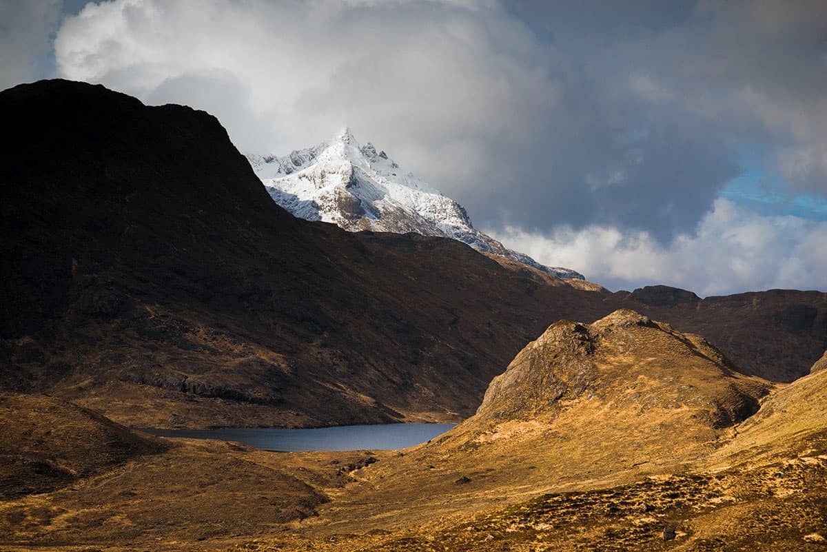
After
I’ve always resisted chipping in with my opinion on the ongoing debate of purity vs post-processing, but my stance is this: the process of creation should be championed and is a reward in itself, regardless of opinion. All art forms rely upon personal interpretation and no one is right or wrong.
Damian’s step-by-step tutorial
1. Basic adjustments
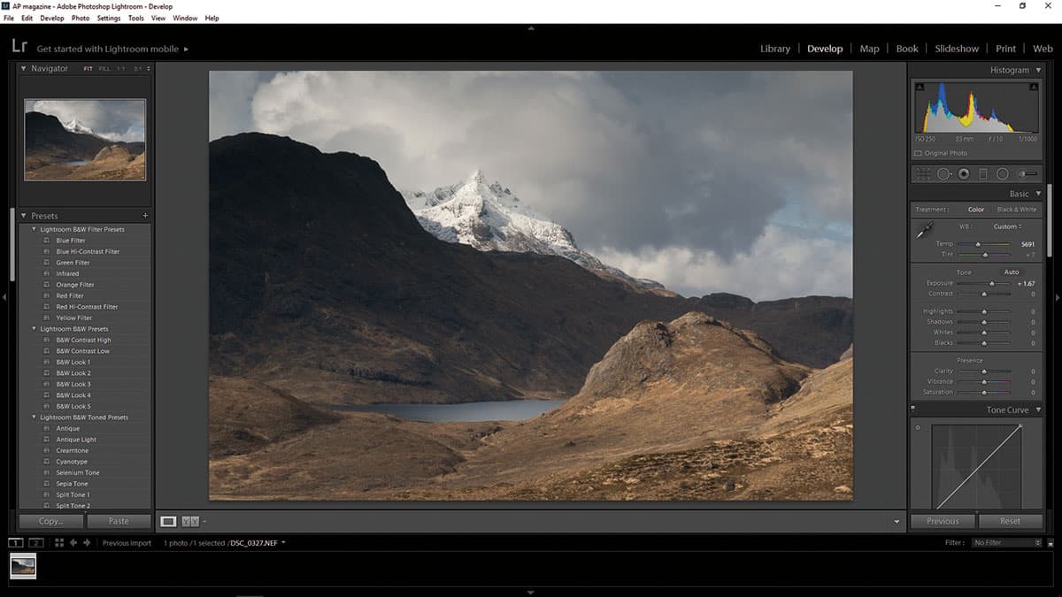
Once I’ve Enabled Profile Corrections under Lens Corrections, I make general adjustments. Exposure is first, paying attention to the histogram, making sure the clip warnings stay off and the tonal range mainly sits centre. With White Balance I try to be sympathetic to the location’s range of hues – in this case preserving the warmth of light over the brownish bracken, yet making sure the snow on Sgùrr nan Gillean retains its chilly blues.
2. Expand tonal range

I want to expand the tonal range by adjusting the Highlights and Shadows, being careful not to swamp darker tones and preserving the high-key information on the snow-capped peak. Moving on to Vibrance and Saturation, you have to tread carefully. I tend to use vibrance more and hold back on the Saturation, I want to enhance the light’s ability to intensify the naturally muted hues without making things too surreal.
3. Boost contrast

The Curves tool comes in here to give it a more three-dimensional look. I place two points on the line to anchor the strongest highlights and deepest shadows, so that when I add a slight ‘S’ curve across the middle range I don’t clip the extreme ends of tone. As always, keep an eye on the histogram and at this point I will jump back up to the Highlights slider as I worry about the peak becoming too blown.
4. Hue, saturation, and luminance
The icons next to each section are great for clicking and dragging within a localised point to fine-tune a colour. I have increased the Luminance of the Yellow/Orange in the foreground to enhance the play of light across the land and add more depth at the same time. I also slightly desaturated the Yellow through the sky and saturated the foreground Orange to increase the contrast of cold to warm from top to bottom.
5. Split toning

This is something I use more and more in my processing and is becoming integral to the look of my work. I want to enhance the contrasting relationship between land and sky. Cold hues recede to the eye, and warm hues come forward. I strengthen this effect by creating a wash of colour (sympathetic to the natural hues of the land) through the Shadows and, conversely, a colder wash through the Highlights.
6. Gradient tool
First, I drag one from the bottom up and adjust for slightly more Contrast, Clarity and Saturation, and inversely I drag another from the top down, adjusting the same parameters but the opposite way. I’m slightly replicating here what the human eye does naturally, by giving more clarity to what is nearest to our direct gaze. Lastly, I go into Photoshop where I clean and sharpen, also checking the final histogram.
Steve Gosling
Steve is a UK-based award-winning professional photographer who specialises in producing creative and contemporary landscape and travel images. His photographs have been published internationally across a wide range of media. www.stevegoslingphotography.co.uk
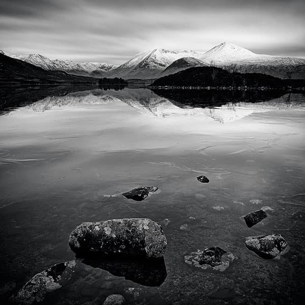
This loch sits on the edge of Rannoch Moor – a vast expanse of open land that I frequently cross on my way to Glencoe and beyond to the Scottish Highlands and Islands. This area has become one of my favourite parts of the UK for photography. It’s a rugged, wild landscape that I find very inspiring. It can also be an incredibly frustrating place to work – the weather is very changeable (they say in Scotland that if you don’t like the prevailing weather, just wait 20 minutes as it will inevitably change). But that adds to the challenge and makes it all the more rewarding when everything comes together in a successful photograph.
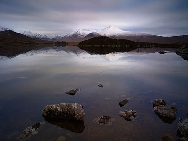
Before
On this visit the loch was frozen, the distant mountains were covered in snow and an interesting cloud-filled sky sat above them. I set up and waited. Luckily, as the day was drawing to a close (and just as I was beginning to fear that this would be another wasted visit), the sun broke through the cloud and gently illuminated the mountain tops. I had my shot.
The raw file showed I had managed to record all the required detail in the Shadows and Highlights, and revealed the potential for a successful colour image as well, but my first interest was to get a black & white print using Capture One Pro.
After
Steve’s step-by-step tutorial
1. Quality colour file
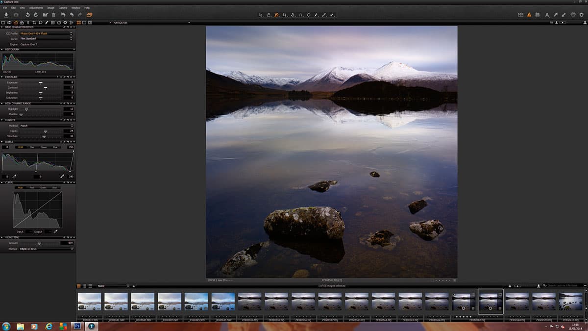
My first step is always to get a good-quality colour file as a starting point for the conversion process to monochrome. The image was cropped and exposure adjusted to brighten the image, particularly in the Highlights, to draw attention to the light on the mountains. I also increased Clarity and Structure to enhance the detail in the foreground stones.
2. Convert to mono
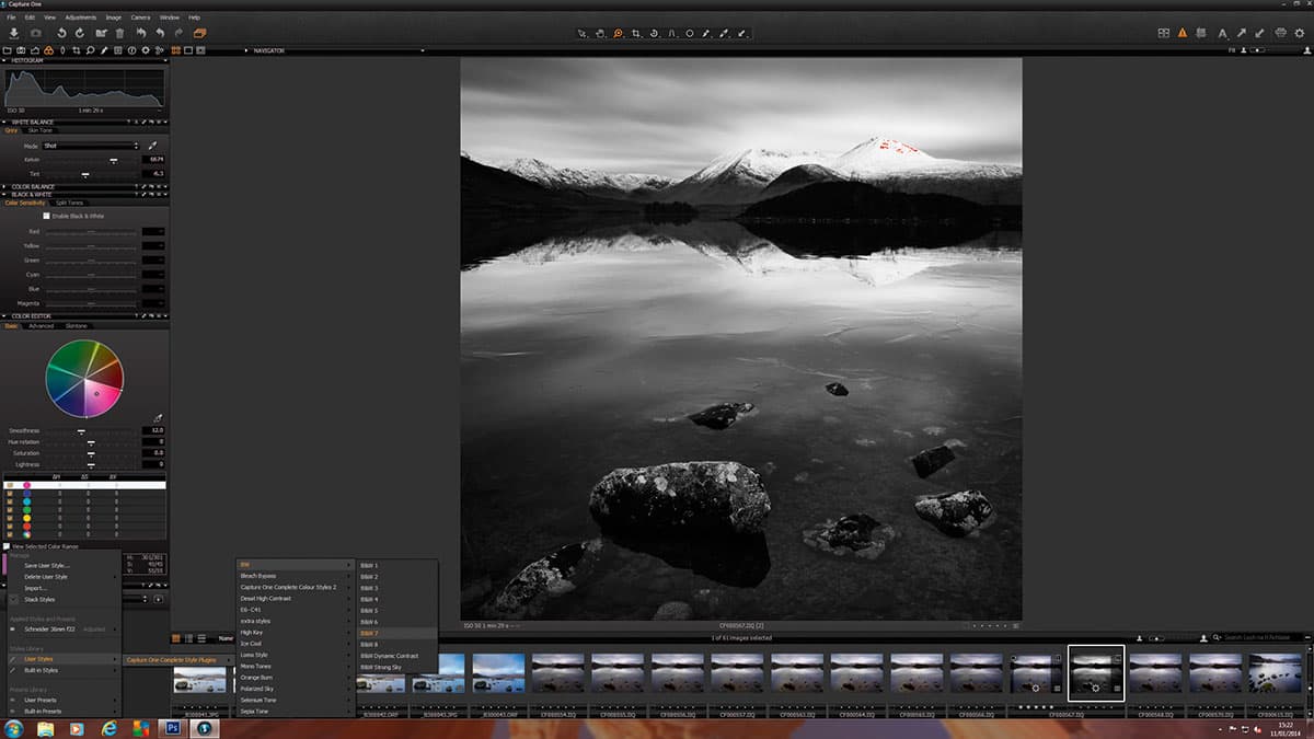
The next step was the conversion to b&w. I used one of the presets available as a download for Capture One Pro, in this case ‘B&W Style 7’. Although I’ll usually look at the effects of using the other styles and presets, this remains a favourite. As is my way, I use these as a starting point, then fine-tune the result to suit my own vision and adapt for each individual image.
3. Vignette
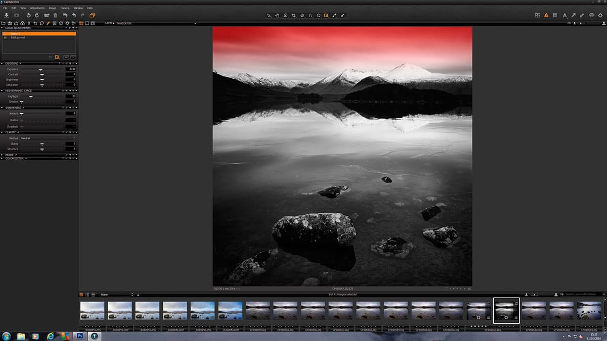
I then decided to add a vignette to darken the corners of the frame, and adjusted the Exposure curve to alter the contrast and lift the midtones in the image. The penultimate step was to darken the sky through the use of a local gradient adjustment layer, before then cloning out any unwanted dust marks, sharpening and exporting the file for printing.