
Gels can really add drama to your flash-lit images. All photos by Jake Hicks
Coloured lighting has been part of our visual storytelling process as far back as the 1600s, when Shakespearean theatre lights were shone through red wine to alter the colour and mood of a scene. When colour film became popular in the 1940s the process was adopted by cinema, and cinematographers would often use coloured lighting to tell a story and create a mood. For example, adding yellow and orange gelatin sheets in front of lights to simulate sunsets and sunrises. Although we no longer use gelatin sheets the name ‘coloured gels’ stuck, and stills photographers use the technique to add dramatic coloured effects to their work for a more artistic look.
The use of coloured gels in photography reached fever pitch in the 1980s, but as the colour combinations became more and more garish and visually offensive they eventually fell out of fashion. It’s only recently that coloured gels have seen a resurgence, with digital photography empowering a new generation of photographers to experiment with colour.

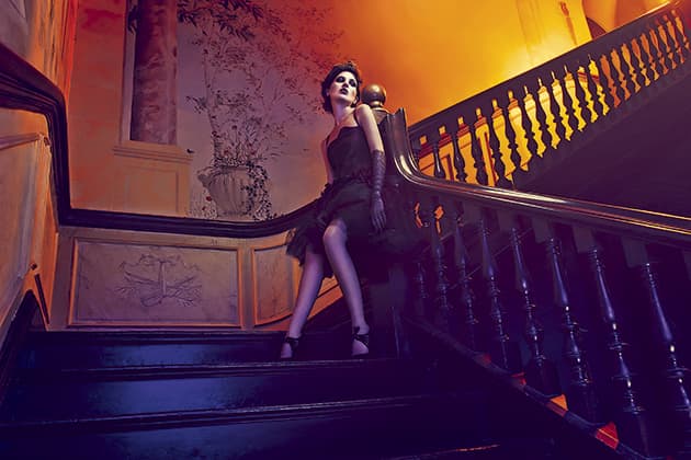
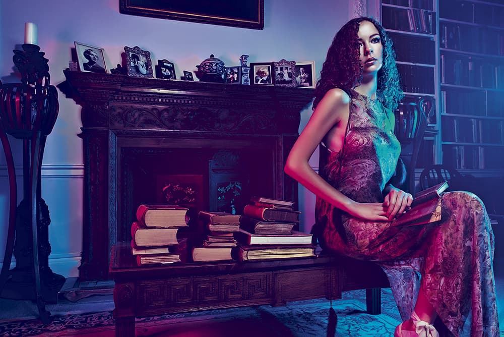
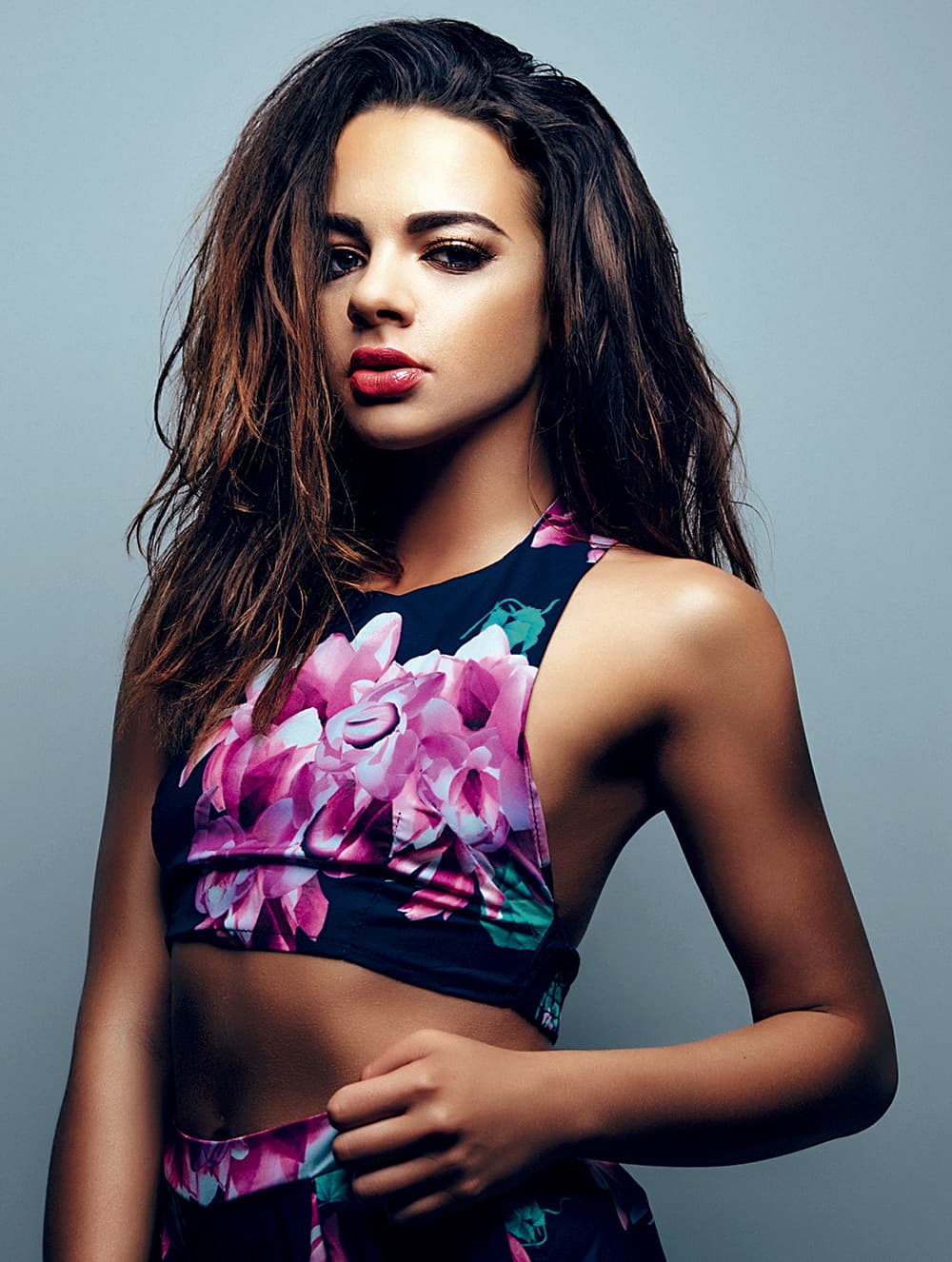
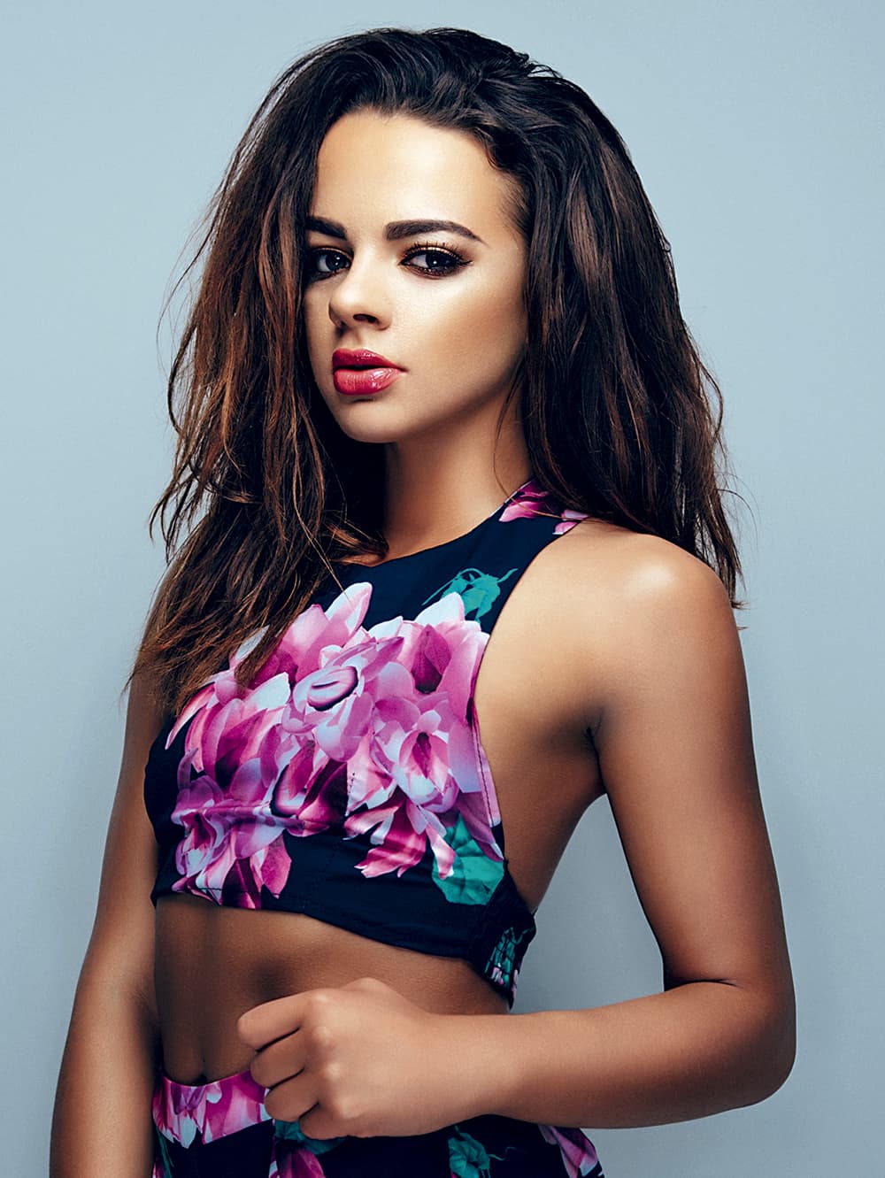
Coloured gels deliver a very cinematic quality to your shots
Technical or artistic?
Coloured lighting and the use of coloured gels fall into two main categories – technical colour correction and artistic effect. Technical colour correction is used for matching a tungsten bulb colour to the colour outside and is especially useful on location shoots. For example, you could be trying to light a model with a standard house light and daylight is coming in through a window in the background of the shot. Without colour correcting the warm tones of the tungsten bulb, the model will look orange, so you’d need to add a colour temperature blue (CTB) gel to your lamp to match the colour of the background daylight.
These colour adjustments are often very similar to white balancing on your camera and are only really useful to know when you have more than one colour temperature within the same shot. Although the technical colour correction is useful, it’s not as fun as using coloured gels for artistic effect, and this is what we’ll explore in more detail here.
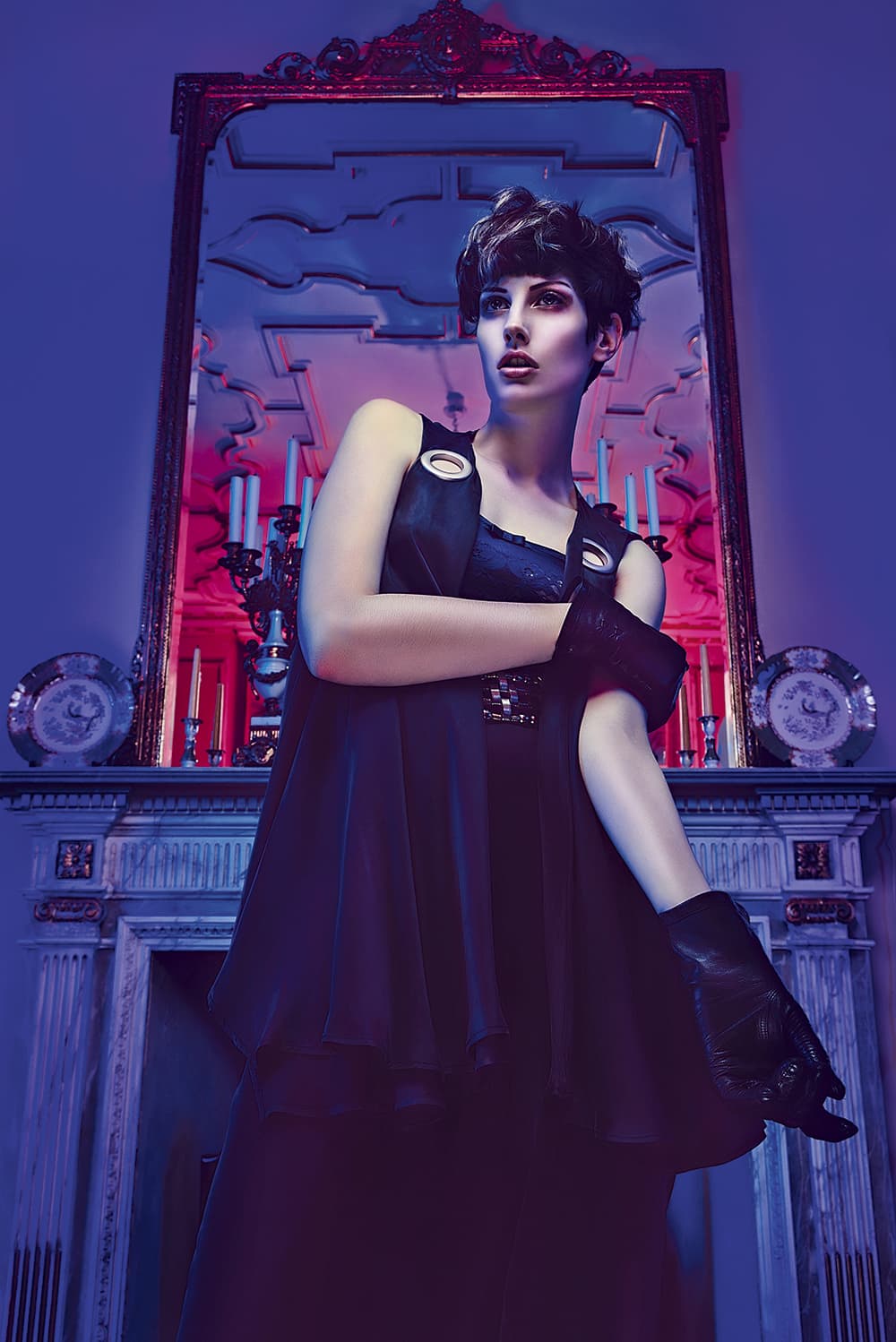
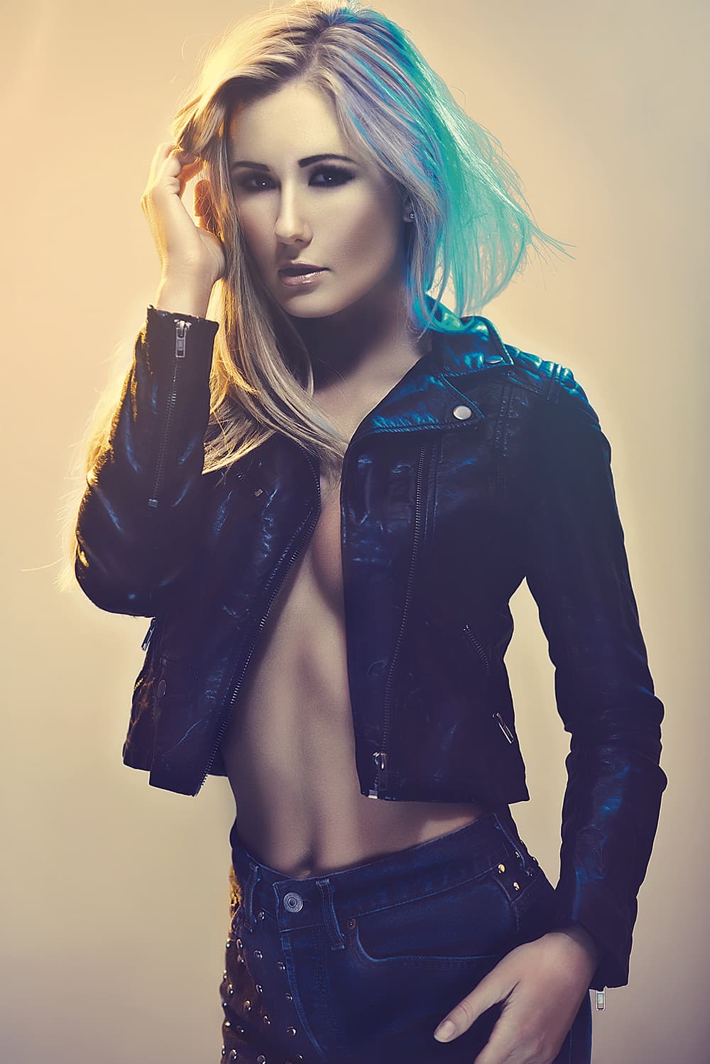
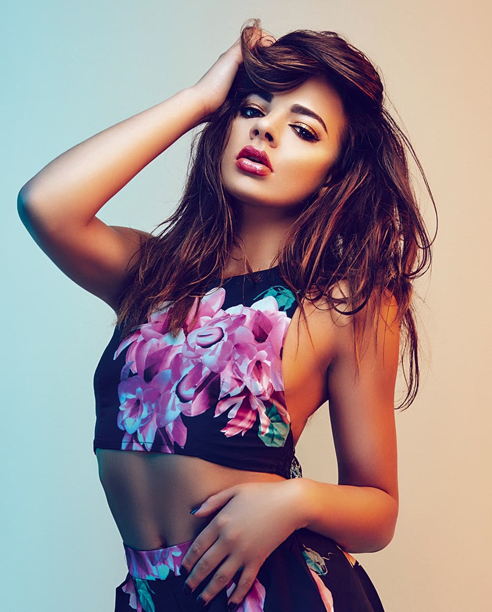
Don’t underestimate the power colour has on viewers’ perception of a shot
Using colour wisely
Using coloured gels in your photographs can be a great way of making images stand out, but don’t underestimate the power colour has on viewers’ perception of a shot. It’s a good idea to think about what you’d like to convey with the colours you’re using, as certain colours will always affect us in certain ways.
For example, we all know red is a very powerful colour but depending on the context it can convey very different messages. If you use a lot of red lighting in a boudoir shoot it will convey ideas of love and lust, but red lighting used in conjunction with a boxer will portray power and anger. As a rule, reds tend to evoke more energy and passion whereas cooler colours such as blues evoke calmer and more centred feelings. As a result you’ll often see it used in corporate photography shots.
As your confidence builds in using gels, it is then possible to combine multiple colours, but you still need to be careful about the message you’re portraying. There are a couple of colour combinations that you need to be wary of and treat with extra care.
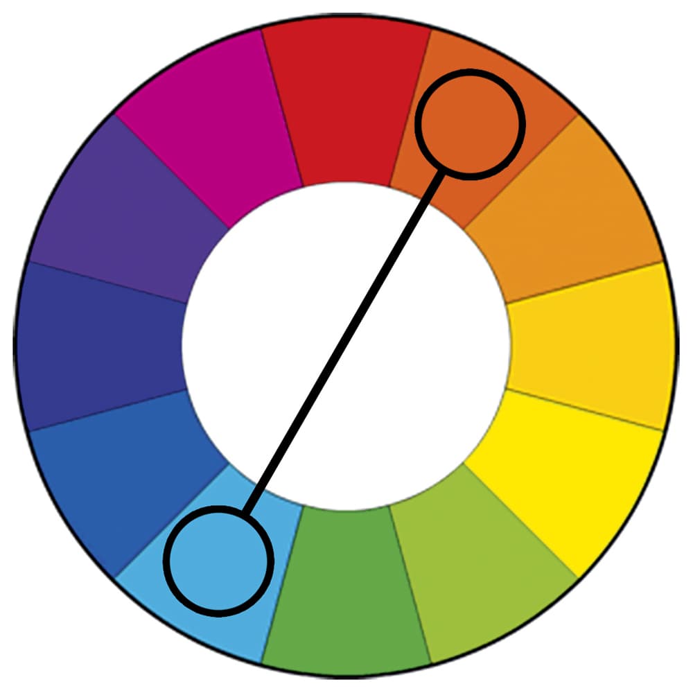
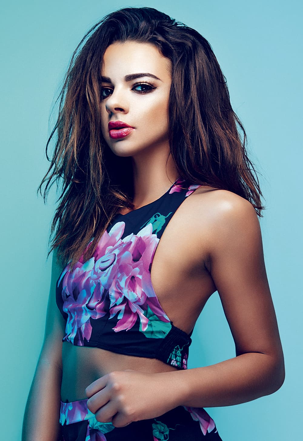
Basic colour theory will help you choose colours that complement each other
Colour combinations
When colours like red and green are combined you need to be extremely careful that the images don’t look like a Christmas card. Together these two colours have now become synonymous with the season and as a result it’s very difficult to tell a different story.
Another colour combination that we have been programmed to recognise is red and blue. This colour pairing is frequently used in films to signify emergencies as they represent the colours of sirens, and you need to be especially careful when using them.
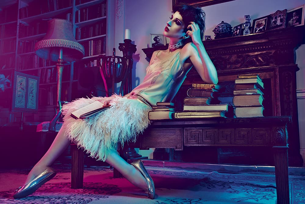
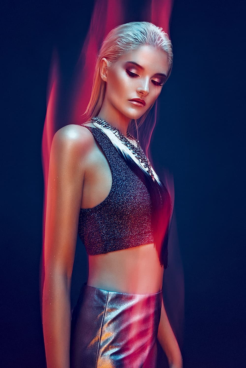
Under or overexposing your lights will create different colours
Colour theory
So now that we’ve taken a look at some of the colours we should be wary of, let’s take a look at some good colour combinations to start playing with. As a standard guide I would always say that complementary colours work well together. Complementary colours are the colours opposite one another on the colour wheel. One colour pairing that never fails to impress is orange and blue, a combination of colours that is always pleasing to the eye.
Just as red and green symbolise Christmas, orange and blue symbolise the warmth of a sunset or a beach, and the purity of the sky or the sea. This colour combination can be found all around us – from logos and design to films and paintings.
When using more than one light, try to avoid the two light sources contaminating your shot
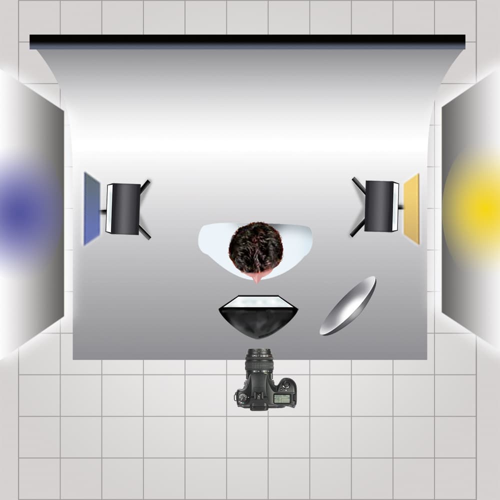
Quick and easy set up
This lighting technique is one of the easiest ways to get great-looking colour into your shots. Start by selecting your preferred key light – I used a 21in silver beauty dish here, but a small softbox will work equally well.
Why not try this set-up yourself?
I then added a little fill light via a small softbox on the floor below the model, but a well-placed silver reflector will do just as well. I then added the colour via two hard lights behind the model pointed back towards the camera and aimed at the sides of the model’s head. These two lights have grids on them to control the spill of light and are angled just far enough away from the lens to minimise the introduction of flare.
The fill softbox is metered one stop under the key light and the two coloured gel lights are metered one stop above the key light.
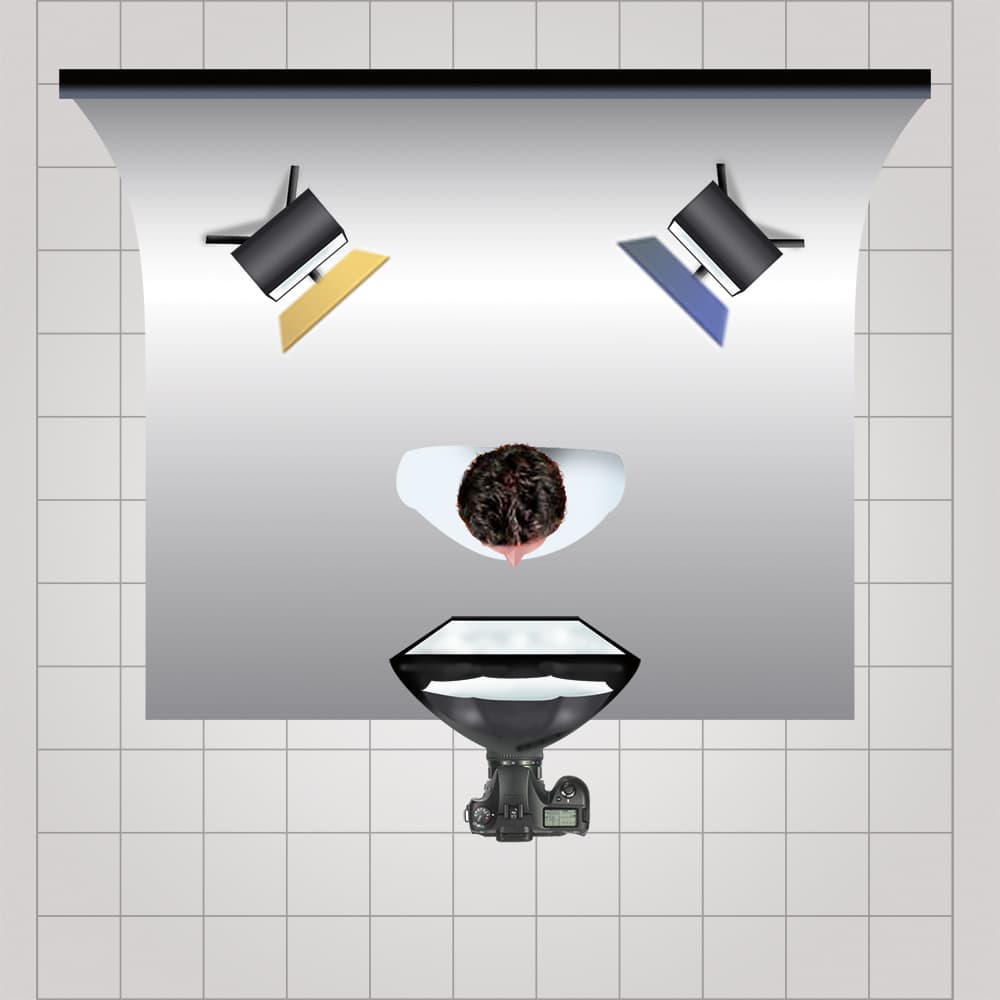
Two hard lights behind the model add colour
Top tips
1. Be mindful of the mood certain colours will convey. Shooting with red and green will often leave an image looking like a Christmas card and using red and blue can, at times, make a photograph look like a scene from a police chase.
2. When combining colours, try to bear in mind some basic colour theory. Complementary colours like orange and blue, and purple and yellow will always work well together. It’s also vital to understand the styling of the shot, and base your colour theory around the colours of a model’s outfit.
3. If you plan on using coloured gels on model shoots then be aware of your colours spilling onto the model’s skin. Sometimes this can create unwanted effects such as unflattering shine, and strange hues as it mixes with natural skin tones.
When combining colours, bear in mind some basic colour theory
4. If you’re going to be combining more than one coloured gel in a shot, place your lights so that they don’t contaminate one another. When two colours mix within an image they can sometimes create undesirable colours. A good way to avoid this is to place your subject between the two colours, resulting in them falling on either side, but never actually meeting.
5. Remember that when you’re trying to expose your coloured gels correctly that under or overexposing them will create different colours and this is down to personal taste rather than being right and wrong. For example, underexposing an orange gel will give you a rich golden brown, whereas overexposing it will give you a sunburst yellow. Experiment with your own gels and see what variations you can get from over and underexposing them.
Get the look
Light is bounced off white boards for a subtle look
There are times where you will want to introduce coloured gels in a more subtle way. I recommend one way of doing this is by diffusing or softening the coloured light before it hits the model. In this example I’ve used a beauty dish and two different coloured gels to achieve the desired result.
1. Add main light
The first thing you need to do is to set up your standard portrait lighting by placing a beauty dish just above the model’s head angled down at 45°. You could use a small softbox but make sure it’s as close as possible to avoid too much spill of light. The next step is to soften the shadows.
2. Lift shadows
You can do this by placing a small softbox at the model’s feet angled upwards and meter it at a stop below your key light. It’ s possible to try this set-up with a reflector rather than a softbox, but just be aware that it will never be as powerful, so the resulting image will have more contrast due to the darker shadows.
3. Add first colour
I have added blue to the left camera, and as I am going for a far softer colour palette I want to avoid using hard lights. You need to diffuse the coloured gel by aiming the gelled light away from the model and bouncing it off a large white board, but a similar result can be achieved with a thick white cotton sheet.
4. Second colour
Finally the second colour is brought in on the right-hand side – set up in exactly the same way by bouncing an orange gel off a large white board. It is also useful to note that these two colours were chosen because the orange and blue go really well with the pinks and violets of the model’s outfit.