AP Forum Competition Winners 2012
Internet forums
can offer the opportunity to share information, give advice and, in the case of
our own web-based community, show of your well-honed photographic skills.

Each month our
competition presents our forum members with a Samsung 32GB Micro SD card with SD
adapter for the winner, and 8GB cards and adapters for the second and third
places. Second and third places also get an ‘Amateur Photographer Loves My
Pictures’ mug.
 January – Cold As
Ice
Derwentfrozenwater
Benchista
Benchista has
created a wonderful picture that shows us an amazing view, in amazing conditions
and in amazing circumstances. You can feel the cold just from the coolness of
the cyan/blue sky, and the blue shadows and mist in the mountains further that
impression.
The blues seem so
much cooler because of the warm colours of the sun on the frozen lake in the
foreground – cover it over with your hand to see what we mean. It’s a long thin
picture, but it doesn’t need cropping top or bottom, as the stripes of blue,
grey and peach are very comfortably proportioned. And our favourite bit? That long
shadow behind the man on the ice.
Great shot,
Benchista!
 February -
Contre-Jour/Lit From Behind
Flaming Hair
BrianWall
What an absolutely
stunning picture. The colours are incredibly powerful. Technically, of course,
it is dreadful, with all that lost detail and pixelation, but had it been
crispy and detailed it would not have possessed half the charm or the same
degree of drama.
The girl’s hair is
alight with the fire of the setting sun, and the wind blows the flames across
the frame. The sea in the background is like molten lava flowing at her feet.
The colours are so intense you’d be forgiven for being unsure if this was a
vision of heaven or of hell, although we’d be inclined to believe it is the
former.
Just brilliant,
and the kind of picture you can go back to again and again.
 March – Still Life
Ghirardelli
Betinalap
You’d have to be
lactose intolerant to not be drawn to this image. You can taste what those
things would be like in your mouth, and smell what your nose would experience
were you to place your nostrils close to the warm, melting, soft, gooey slabs.
The focus ensures
we maintain our attention at the action-end of things, as if the draw were not
strong enough already. And the softening into the distance delivers a faint
hint of romance. The plain background gives us nothing with which to distract
ourselves, and the clever backlighting aids depth and gives a sense of place
rather than pure, factual studio.
 April – In The
Garden
Spring Sunshine
IanJTurner
This is the kind
of picture that is so great you think it must be constructed. The arrangement
of the heads, and the perfect depth of field that makes the stamens stand out
but which still allows the defining shapes and colours of the daisies to be
described, look very organised. The perspective is close-to, as from a standard
lens that allows big foregrounds and exaggerated differences.
The colours,
pastel but bold at the same time, are simultaneously vibrant and relaxing.
Their distinctive characteristics are strangely familiar – unusual and typical
in one. IanJTurner has clearly thought about what he wanted to do, and has done
it in a deliberate manner. It’s very good.

May – Something
Small
Clematis Head
Devon_Eric
This is a pretty
amazing shot. It’s a great subject, for sure, but as we all know that doesn’t
make a picture on its own. It is a combination of great lighting, a good choice
of background and blue tone.
We’re pleased
Devon_Eric didn’t decide to make the background completely black as that would
have introduced a harshness to the image. Having a moderate grey works very
nicely, providing just enough contrast to make the subject stand out, but
without overdoing the contrast to make the shot dramatic. The light from behind
creates that bright furry edge, as well as the darkness in the core of the
head, and that catchlight on either side of the stem prevents it disappearing
into the background.
 June – Non-Human
Life
Life? Certainly
not as we know it, Jim
Devon_Eric
We loved this
picture from the first moment we saw it. For us, it conjures up images of
strange sea creatures, perhaps the distant cousins of jellyfish, and red blood
cells, photographed with microscopic precision. But that’s not why we like it.
Its appeal lies in its ambiguity. It’s not entirely clear what the subject is
but whatever it is, it is mesmerising. The glistening blood-red colour, what
appear to be splashes from the top of the objects and mesmerising, swirling
patterns all come together to form a compelling image. Technically strong and
nicely lit, the allure of this image is in its abstraction.
 July – Travel
Journey
Marty G
This image is
uncomplicated, unfussy and like the sketches Bert makes in the film Mary
Poppins, makes us want to leap into the picture and join these travellers on
their adventure. We’re used to seeing landscape images shot in a horizontal
format, but fewer are shot vertically – and successfully. One of the main
strength’s of this picture is Marty G’s decision to shoot vertically so the
people are at the bottom of the frame. They are perfectly placed in the centre
and the light falls on them in such a way as to highlight their expressions and
gestures. We, the viewers, want to follow the people beyond the edge of the
frame and it is this impression of motion that is the photograph’s key.
 August – Olympian
Future Olympians?
Devon_Eric
This image stood
out straightaway. The expressions on the children’s faces – their sense of
anticipation, determination and focus – is palpable. It’s unclear where this
image was taken, but its suggestion that these children may be Olympic
champions of the future is a clever take on the theme.
From a technical
point of view, the lighting is great and the exposure spot-on. The variety of
tones and shadows on the figures, coupled with the shallow depth of field,
helps to give the image depth. It’s good how Devon_Eric has crouched down
slightly to the children’s level to take the shot, which draws the viewer into
the scene, and we like how he has used the surrounding figures to frame his
main subject.
 September – Leaf
New leaves
RexK
RexK’s picture is
a particularly strong example of backlit plants and flowers. There is something
very delicate about the lighting that grabbed us straightaway. You could be
forgiven for assuming it was taken with natural light and the way the light
illuminates the reds, pinks, oranges and yellows of the leaves is fantastic.
The light also accentuates the vein patterns of the leaves to interesting
effect.
It may sound
silly, but it is a moving image. There is something quite touching about the
scene – a flourishing plant against a dark, menacing background. In this way,
there is a kind of story at play here that you don’t often find with plant
images. It’s a strong and worthy winner.
 October – Above
Your Head/Looking Up
Shinjuku, Tokyo
Yebisu
Without the bird
this image would be sorely lacking and not half as striking as it is – the bird
anchors the picture and provides a vital focal point. Did Yebisu find this
scene, frame the shot and then wait for the bird to fly into the frame, or was
it was a happy coincidence that the bird appeared?
This is an
excellent image and it is clear that a lot of thought has gone into the
composition’s design – the interplay of the light and the material of the
buildings, and the buildings’ leaning angles, for example. We also love the
traces of grain you can see in the buildings and sky, which contributes to the
image’s authentic, timeless feel, and the subtlety of tone throughout.
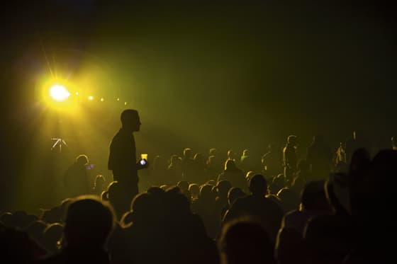
 November – High
ISO
Outdoors
Late-Night Concert Crowd
Mike_Morley
It’s often
difficult to pinpoint exactly why an image catches your eye, but this one does
for a couple of reasons. First, the silhouetted figure towards the left of the
scene commands the space so well without being overbearing. Even though he is a
silhouette he is a very strong presence, indeed the focal point of the picture.
The light source
positioned neatly above him in the top left-hand corner is another
compositionally strong feature and draws the eye first. The golden light gently
outlines the gaggle of people in the image. The use of light here is super – it
is as much a character in the scene as the figures themselves. It’s a very
interesting winner for November.

December – Where’s the colour gone?
Winter Swan
JaySteel
Swan’s
seem to be a recurring theme in the art of the Western world. It began all the
way in the 1500s when Leonardo da Vinci produced his now lost painting of the
story of Leda and the Swan. Ever since then the brilliant white bird has popped
up time and again making it a enduring symbol and subject. They’re undoubtedly
a popular theme in photography too. Take a look at the wildlife photography of
Alex Saberi for a good example.
I
have to say this image leapt out at me right from the start. I’m a sucker for
fairy tales. As a child I wasted many an evening devouring the stories of the
Brothers Grimm, Angela Carter and Hans Christian Anderson. It’s difficult not
to look at this image and feel like a child again. The image is saturated in
atmosphere. It almost seems to be from another world entirely. I just love the
mist, the swan, the hazy sun and the trees that look like twisted hands. It’s
only when you notice the park bench in the background that you realise the kind
of location this was taken in.
For
my money this is great interpretation of the brief. When faced with the title
‘Where’s the Colour Gone?’ the obvious choice would be to produce a monochrome
image. But here we see that JaySteel (and a few of our other submissions) chose
to take a different approach. The autumn and winter months seem to drain the
colour from the environment and leave behind washed-out, murky tones. The mist
creeps into the landscape and obscures the horizon, rendering the objects there
as barely in-focus silhouettes. Look to the sky and you can see the sun
fighting a losing battle against a ground level ocean of grey.
The
compositional balance of the image is subtle but effective. It’s the
reflections of the trees and the hook of the swans neck and head that hold
everything in place. Perhaps there could have been a little more space between
the edge of the frame and the swan’s reflection but that’s a minor quibble. The
fact is, it works.
All
in all this is a shot that I’m very fond of and is, in my opinion, a more than
worthy taker of the number one spot of this particular round. Congratulations
to JaySteel.
2013 Themes
Taking part in a
light-hearted contest like the monthly AP forum competition is great fun,
inspiring and can help you get a bit of direction into your photography.
Here are the
themes for 2013, so you can plan ahead.
Visit transport.kelsey.host/amateurphotographer/forums (monthly competition) for a full briefing.
| January | The Colour of Night |
| February | The City Up Close |
| March | In the Shadows/Light and Dark |
| April | Framing the Shot |
| May | Looking Down |
| June | Seeing Double/Reflections |
| July | Square Format |
| August | Human Wildlife |
| September | Reach for the Skies |
| October |
The New and the Old |
| November | Wild World/Animals |
| December | Winter Wonderland |
AP Forum Competition Winners 2012 sponsored by Samsung
![]()