Forum competition results for January 2013 round – The Colour of Night
The Colour of Night. It seems like an oxymoron. How can there be colour in what is essentially a void of light? But the fact is, in the 21st century, darkness can be hard to find. Stand on top of any hill located on the edgelands of any city or town and you’ll soon see the forest-fire orange of, what has become known as, ‘sky glow: the aura above our urban areas, amplified by water droplets in the air and other particulate matter. Venture further into the night time of the urban landscape and the combination of light and colour is almost blinding. Street signs, billboards, high pressure sodium street lamps and shop displays all light our paths on our journey through the city. Often it’s so bright that it eradicates the true colour of night: the stars in the space above our heads.

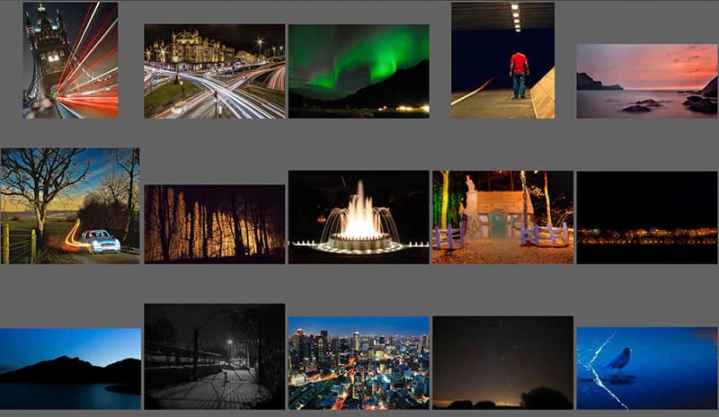
The brief for this round was deliberately slight. It’s one that was very much open to interpretation, and I’m very happy to see that you all let your imaginations fill in the blanks. There were many stand out images, not least among them caledonia84 with a shot of Charring Cross, Glasgow. We often see pictures of the light trails left by traffic but caledonia84 has chosen just the right time of evening to capture the mad rush of traffic and saturate the shot in beams of illumination.
Another particular favourite of mine is ‘You Know You’re Home’ by Geren. It’s a simple and beautiful shot of, what I assume is, the horizon lights of a motorway or distant town. The small circles of light (the effect known as bokeh) against the dark void are genuinely mesmerising.
My other favourite is by daveben and is titled Light in the Darkness. It’s a shot that brings to mind the old Universal horror films from the 1940s and 50s – gates, mist and low-key lighting. While you could argue that there could be a little more tonal range in the image that fact is the atmosphere is definitely present, and that’s the important thing.
Special mention must go to Andrew Axford’s entry called the Colour of Night with a Full Moon. It’s easily one of the most ambitious entries. I really love it.
 3rd Place
Yebisu – “Osaka at Night”
I’m not a big fan of cityscapes. Where others find beauty in the sprawling manmade structures I just see claustrophobia, alienation and people staring at me – even the seagulls seem to be laughing. I guess I’ve always been a paranoid killjoy. However, this shot really won me over.
This shot occupies an extreme of the theme. Compare it to our second-place winner and you’ll see what I mean. Where that image is quiet and mysterious this shot is vibrant, bustling and loud. The sense of scale is astonishing. The colours and lights really bleed from the image and give us a great sense of the colour of night living within a city. It’s often said of New York that it is the city that never sleeps. In fact, that’s true of any major city, Osaka included. If a city never sleeps night can never truly fall. Light is everywhere and the colours remain.
 2nd Place
catriona – “Blackbird Singing in the Dead of Night”
Birds robed in black have always been afforded veneration and fear. Crows, ravens and blackbirds can at once inspire awe at their beauty and intelligence, and superstition motivated by our symbolic associations. While crows and ravens seem to carry the burden of this, the Welsh poet R S Thomas once wrote that the blackbird has ‘a suggestion of dark places about it.’ Blackbirds are not generally seen as symbols of bad luck but it is a bird that evokes the nocturnal.
Catriona’s shot is genuinely strange and slots into the brief nicely. The blue cast on the image renders the shot almost dreamlike. It seems to be a shot taken at a time that’s not quite day and not quite night, though I wouldn’t go so far as to call it dawn or dusk. The shot is nicely framed by the tide giving us a good sense of location and context.
I would perhaps suggest that Catriona find a way to crop out the illumination on the top-left. Once your eye moves up to that area there is a risk that the spell is broken. But that’s a minor quibble. It’s a really interesting shot.
 1st Place
cas100uk – “Should I?”
Tableau photography is a genre that first appeared at the inception of photography. Many of the first images ever taken were set-ups shots that hinted at a wider narrative. Through tableau, we are afforded a brief glimpse of a story. Each image is a moment in time that subtly hints at what has come before and what is to follow. The same could be said of documentary and reportage, but the events of tableau are planned, staged, and guided. They are a play on mood and economical storytelling.
Here we have, on the surface, a simple image: a man standing in an underpass staring into the darkness. His body language suggests hesitation. Should he follow the guiding line towards the black expanse or return to the safety of the light? We’ll never know what he did. Or perhaps we will. Tableau allows our minds to run free. It allows us to create our own histories and draw our own conclusions.
The title, in my mind, alludes to that niggling thought that must go through the heads of a thousand characters from a thousand horror films. ‘Should I really venture into the darkness?’ Of course they shouldn’t. But they will. And they always regret it. However, no risk, no reward. In the darkness lies mystery and opportunity. The path beneath your feet has to lead to somewhere, but who knows where.
I’ve selected this image as our overall winner because of the feelings it evokes as well as its successful interpretation of the brief. Here we have both approaches to the theme: the strange cast of yellow tungsten light and the absolute void of colour delivered by darkness. Both say different things but both have come together to create a real winning image. Congratulations to cass100uk.
Enter our March competition here
See all the entries for this round
See all comments for this round
Leave your comments for winning pictures here
AP Forum competition results – sponsored by Samsung
![]()